新規記事の投稿を行うことで、非表示にすることが可能です。
2023年12月19日
四字熟語書写 No.491/No.488
にほんブログ村
四字熟語書写の2回分のお題を書いてみました。
第491回
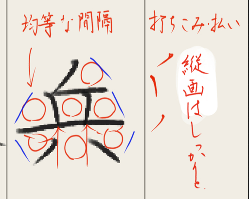
「兵者凶器(へいはきょうき)」
https://x.com/yojisyosya/status/1732837378543288508?s=20
第488回
「深厲浅掲(しんれいせんけい)」
https://x.com/yojisyosya/status/1731750216976458057?s=20
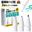
Apple Pencilで書いています。
 | 価格:1080円 |
字を美しく書くのは難しいです。本当に。
私は極力全体に対しての個々のパーツの配置を等間隔になるように気を使って書いていますが、なかなか思うように点画を配置できずに残念な気持ちになることばかりです。
私が注意する点は以下の通りで、今回書いた2回分についてどのような意識で書いたか解説してみたいと思います。いろいろ考えながら書いていくので段階的に更新していくと思いますが、「書いている途中なんだな」と思ってください。
(1)起筆と線の方向性
主に縦画において、最初にペンを置いた際の打ち込み、起筆は強めに入れています。これによって全体の印象が締まってシャープな造形になるように思います。ただ、横画も入れてしまうとくどくなるので、横については伸びやかな線を心掛けています。
また、空間や位置関係が対称的になるような位置取りを意識しています。
線を引くことによって空間が分断されるわけですが、分断された部分部分の比率が均等、または比率が規則的になるようにすることを注意して線をどこに引くかを考えています。
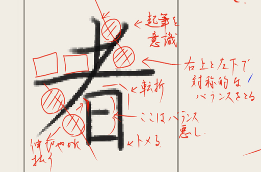
次の漢字の「者」も同様に起筆とバランスを考えています。
横画はのびやかに、そして縦画は打ち込みをいれて起筆を強調、払いがあるところは他の画線に影響がないところはどこまでも滑らかに払う感じです。
点画のバランスは長さの対称性もさることながら、空間の対称性もできる限り考えるようにします。者については、右上と左下の空間で対称性を表現できるように思います。
【このカテゴリーの最新記事】
-
no image
-
no image
2023年10月09日
Japanese morning activity, "Asa Katsu", and "Asa Katsu Shosha." 朝活書写、朝活らじお
What is "朝活 Asakatsu - morning activity"
朝活 is a Japanese term that refers to a morning activity or hobby that people engage in before starting their workday. The term is a combination of the Japanese words "asa" (morning) and "katsu" (activity). The concept of 朝活 has gained popularity in recent years, especially among white-collar workers who want to make the most of their mornings. Some examples of 朝活 activities include jogging, exercising, studying, reading, writing, practicing calligraphy, or pursuing any other hobby or interest. The benefits of 朝活 include starting the day with a clear mind, improving physical and mental health, and achieving personal goals. Many people share their 朝活 experiences on social media using the hashtag #朝活, and there are also dedicated Twitter accounts and blogs that provide inspiration and ideas for 朝活 enthusiasts.
What is 朝活書写
朝活書写, Asakatsu Shosha, is a Twitter account (https://x.com/asakatsu_shosha?s=20) that provides daily writing prompts for calligraphy enthusiasts. The account was started in 2019 and tweets a writing prompt every day at 5 am JST. The prompts are usually one sentence long and are sourced from the Aozora Bunko, a digital library of Japanese literature. The account uses the hashtag #朝活書写, which translates to "morning calligraphy writing." The prompts are written in vertical script, with each line containing 20 characters. The account has gained a following among calligraphy enthusiasts who use the prompts as a way to practice their skills and share their work with others.

Additionally, there is a 'Spaces' on Twitter called "Asakatsu Radio", the hashtag #朝活らじお, that is hosted by two speakers and broadcasts a few minutes before the writing prompt is posted. The space has a few dozen participants every morning who discuss topics related to calligraphy, writing utensils, and the writing prompt.
朝活 is a Japanese term that refers to a morning activity or hobby that people engage in before starting their workday. The term is a combination of the Japanese words "asa" (morning) and "katsu" (activity). The concept of 朝活 has gained popularity in recent years, especially among white-collar workers who want to make the most of their mornings. Some examples of 朝活 activities include jogging, exercising, studying, reading, writing, practicing calligraphy, or pursuing any other hobby or interest. The benefits of 朝活 include starting the day with a clear mind, improving physical and mental health, and achieving personal goals. Many people share their 朝活 experiences on social media using the hashtag #朝活, and there are also dedicated Twitter accounts and blogs that provide inspiration and ideas for 朝活 enthusiasts.
What is 朝活書写
朝活書写, Asakatsu Shosha, is a Twitter account (https://x.com/asakatsu_shosha?s=20) that provides daily writing prompts for calligraphy enthusiasts. The account was started in 2019 and tweets a writing prompt every day at 5 am JST. The prompts are usually one sentence long and are sourced from the Aozora Bunko, a digital library of Japanese literature. The account uses the hashtag #朝活書写, which translates to "morning calligraphy writing." The prompts are written in vertical script, with each line containing 20 characters. The account has gained a following among calligraphy enthusiasts who use the prompts as a way to practice their skills and share their work with others.
 | 価格:2580円 |
Additionally, there is a 'Spaces' on Twitter called "Asakatsu Radio", the hashtag #朝活らじお, that is hosted by two speakers and broadcasts a few minutes before the writing prompt is posted. The space has a few dozen participants every morning who discuss topics related to calligraphy, writing utensils, and the writing prompt.
2023年10月08日
How to write "Bimoji"--- A sense of the beauty in calligraphy 美文字とは
 | DVDですぐ上達! 10日で「美文字」が書ける本 (講談社の実用BOOK) [ 青山 浩之 ] 価格:1100円 |
• Introduction
• The Basics of Writing Bimoji
• Tips to Improve Your Bimoji Writing
• Bimoji for Beginners
• Advanced Bimoji Techniques
• Common Mistakes to Avoid
• Conclusion
Introduction
Ah, Bimoji. You may have heard of it, or maybe this is your first time encountering the term. Either way, Bimoji refers to a Japanese writing style that's quickly gaining popularity across the globe. But what exactly is it? Well, in simple terms, Bimoji involves the creation of beautiful, artistic characters out of basic strokes. Think of it as an art form that combines writing and drawing.
Now, Bimoji isn't a new concept - it has actually been around for centuries. In fact, it was first used by monks and artists in Japan to write Buddhist texts and create beautiful, decorative pieces of artwork. However, with the rise of social media, Bimoji has recently become more mainstream and accessible to the masses.
The history of Bimoji is rich and fascinating. It has played an important role in Japanese art and culture and has evolved over time to become the beautiful writing style we know and love today. So, whether you're a seasoned Bimoji pro or just starting out, there's always something new to discover.
The Basics of Writing Bimoji
Bimoji is a traditional Japanese calligraphy art characterized by bold, thick strokes. To get started with writing Bimoji, you'll need a few basic tools: a brush, ink, and paper. You'll also need to get the strokes right, which can be a bit tricky at first. Here are a few tips to help you out:
First, remember to keep your brush strokes consistent. This means maintaining the same pressure throughout each stroke to achieve the ideal thickness. Also, make sure to use the appropriate brush size for the character you're writing.
Understanding the characters is crucial, too. Familiarizing yourself with the unique shapes and structures of each character will help you avoid common mistakes and improve your overall technique. Take your time with each character until you feel confident enough to move on to more complex ones.
Don't worry if you make mistakes – they're all part of the learning process. It takes practice and consistency to improve your Bimoji writing skills. Experiment with different styles and techniques, such as adding patterns and gradients or adjusting the size and spacing of your characters to give them more personality.
With patience and determination, you'll soon be on your way to mastering the art of Bimoji. Happy writing!
Tips to Improve Your Bimoji Writing
Introduction:
Bimoji is a Japanese calligraphy style that has gained popularity around the world. If you’ve always been fascinated by Japanese culture, then this is an excellent way to express your love for it. In this blog, we’ll take a look at the basics of writing Bimoji, tips to improve your skills, common mistakes to avoid, and advanced techniques for seasoned Bimoji writers.
Tips to Improve Your Bimoji Writing:
When it comes to improving your Bimoji skills, the key is practice and consistency. You need to practice regularly to develop your skills and stay consistent in your efforts. You can't expect to become an expert overnight! Using guidelines and templates will help you perfect your Bimoji writing style. They'll help you maintain consistency in your strokes, size, and spacing. It will help you create a balanced and polished look for your Bimoji.
Trying new styles and techniques will help you expand your skills and develop your own unique style. Don't be afraid to experiment with different techniques and styles, as they'll help you add variety to your Bimoji writing and give it personality. You can also look for inspiration from other artists or online resources to help you try out new styles and techniques.
Remember, it's all about practice and consistency. No matter how long or short your practice sessions are, sticking to them will help you improve your Bimoji skills. So, keep practicing, try out new styles and techniques, and don't be afraid to experiment with templates, guidelines, and other resources to perfect your Bimoji skills.
Conclusion:
There you have it, our tips to improve your Bimoji writing skills. We hope you find these tips helpful in honing your skills and developing your own unique style. Remember, practice, consistency, and experimentation are the keys to improving your Bimoji skills. So, keep at it, and soon enough, you'll become an expert Bimoji writer!
Bimoji for Beginners:
Learning to write Bimoji can seem intimidating at first, but with some practice, anyone can write beautiful Japanese calligraphy. The key to getting started is to take it one step at a time, starting with simple characters and working your way up.
The first step is to learn the stroke order of each character. This may seem tedious, but it is important if you want to write Bimoji correctly. You can find stroke order diagrams online, or buy a book that teaches Bimoji.
Next, it's important to develop muscle memory. This means practicing writing characters over and over until your hand remembers how to write them without having to think too hard. This may feel frustrating at times, but remember: practice makes perfect.
Finally, don't be afraid to experiment with different styles and techniques. Bimoji is a flexible art form that can be tailored to your own personal preferences. So have fun with it and don't worry too much about making mistakes – they're all part of the learning experience.
In summary, start with simple characters, learn the stroke order, develop muscle memory, and experiment with different styles. With these tips, you'll be well on your way to writing beautiful Bimoji in no time.
Advanced Bimoji Techniques
Now that you've mastered the basics, it's time to take your Bimoji game up a notch. Combining and varying character styles is a great way to add personality to your writing. Experiment with different sizes and spacing to create eye-catching effects. Using Bimoji in art and design can also expand your creative possibilities.
When it comes to combining characters, try contrasting styles like angular and curved strokes or mixing brush and pen styles. You can also vary the sizes of characters within a word or sentence for emphasis. Experiment with spacing between characters or even overlapping strokes for unique effects.
Bimoji can be used in various art forms such as calligraphy, typography, and even graphic design. Incorporating Bimoji into your art can add a cultural and artistic touch.
Remember to keep practicing and trying new things. There is no right or wrong way to write Bimoji, so have fun with it!
Common Mistakes to Avoid:
When it comes to writing bimoji, there are a few common mistakes that beginners often make. One of the most noticeable mistakes is inconsistent stroke widths, where some strokes are thicker or thinner than others, making the characters look uneven. Another mistake is incorrect character proportions, which can make characters look awkward and difficult to read. Skipping essential strokes is another common mistake and can lead to misinterpretations of the intended character.
To avoid these mistakes, it's important to practice consistently and take the time to understand the stroke order and structure of each character. Using templates or guidelines can also be helpful in ensuring consistency and accuracy in stroke width and character proportion.
In the end, it's all about taking your time and being patient with yourself. With practice and dedication, you'll be able to write beautiful bimoji characters that will impress everyone who sees them.
Conclusion
We hope you found this guide helpful in mastering Bimoji. Remember to start with the basics, practice consistently, and experiment with new styles. Avoid common mistakes and keep pushing yourself to try advanced techniques. Happy writing!
2023年10月07日
朝活書写 No.1457
ブログランキング←クリックお願いします!
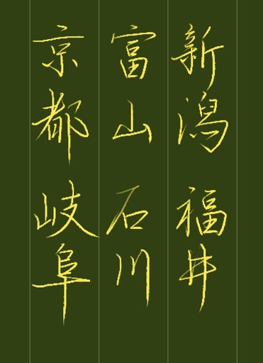
本日も朝活書写を書いてみました。
今回は行書で書きました。
https://x.com/asakatsu_shosha/status/1710384432002253141?s=20
にほんブログ村
2023年10月04日
四字熟語書写 第426回
ブログランキング←クリックお願いします!
四字熟語書写を書いてみました。
https://x.com/yojisyosya/status/1709282169389281543?s=20
朝活書写 No.1454
ブログランキング←クリックお願いします!
朝活書写を書いてみました。
https://x.com/asakatsu_shosha/status/1709297270326198373?s=20
朝活書写 No.1451
ブログランキング←クリックお願いします!
朝活書写を書いてみました。
https://x.com/asakatsu_shosha/status/1708210106968535440?s=20
 | 価格:2580円 |
2023年09月27日
朝活書写 No.1447
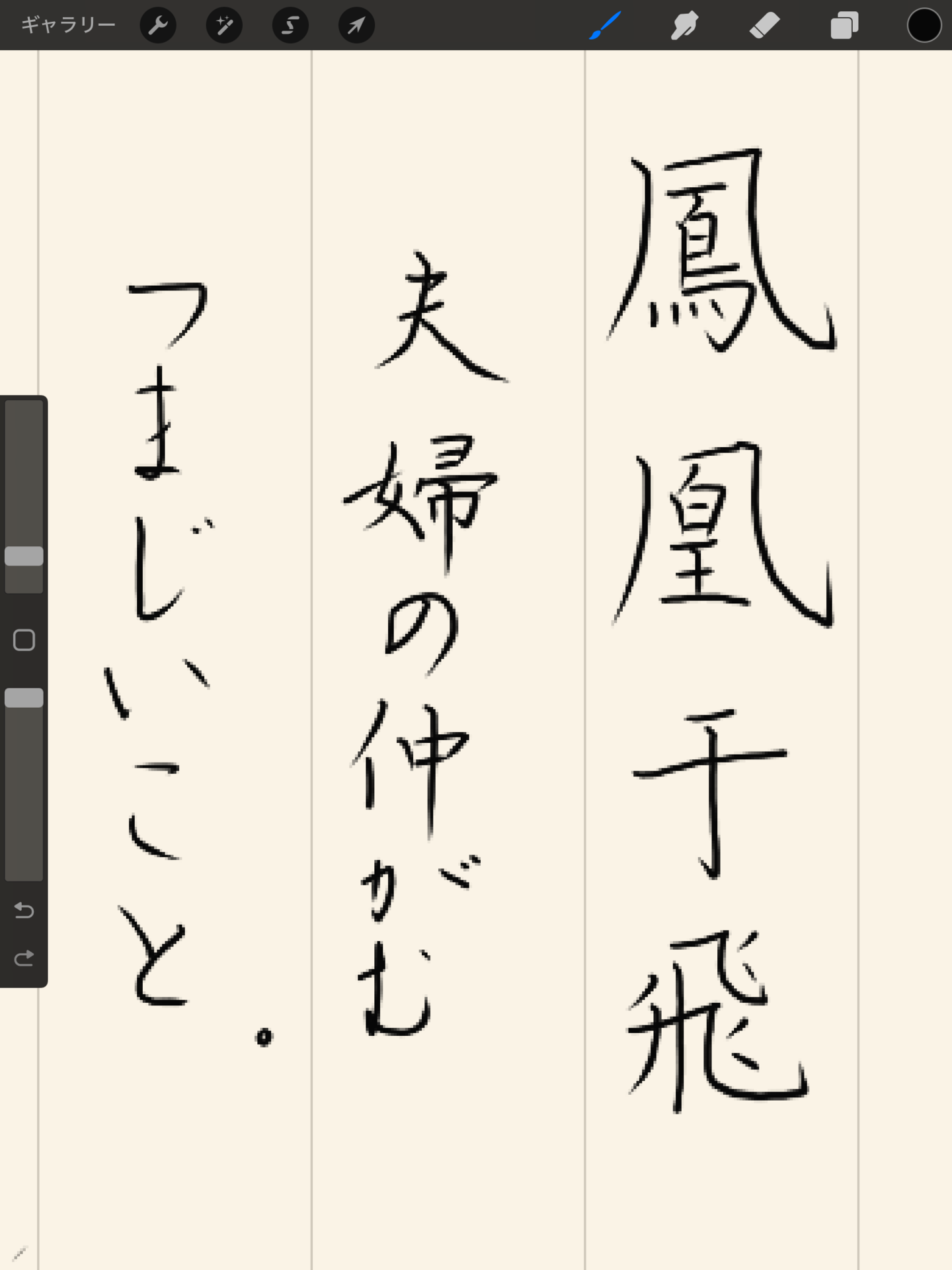
9月27日の朝活書写のお題を書きました。
https://x.com/asakatsu_shosha/status/1706760555074031796?s=20
 | 価格:1320円 |
よくよく考えてみると、文字の難しさは、一つに大まかに言って、点や線の相対的な位置関係によって美しさが決まるようなものですが、そうなればその位置関係というのは角度や距離のバリエーションは無限大にあるようなものです。例えば1画目と3画目の位置関係が相互に呼応していたり、字の中の隙間が対称関係にあったりと、字の作りを構造的に考えると興味がつきません。あとは、いかにペン先のコントロールの制御につなげるかというのがポイントなのでしょう。
本日の朝活書写で使われている漢字を別に書いて拡大してみました。
続きを読む...
2023年09月26日
四字熟語書写 第418回
ブログランキング←クリックお願いします!
四字熟語書写を書いてみました。
https://x.com/yojisyosya/status/1706383068607762442?s=20
パソコンなどの明朝体やゴシック体だと、「比」や「令」など書写体と形になっていることが結構あります。
活字体と書写体の違いですが、活字体の方が技巧が凝らされていて考えようによってはかっこいいのかもしれませんね。
朝活書写 No.1446
ブログランキング←クリックお願いします!
朝活書写 No.1446を書いてみました。
https://x.com/asakatsu_shosha/status/1706398168290882037?s=20
楷書だと、色々とアラが見えてしまいます。
行書だと、なんとなく雰囲気で見せられるような気がしますが、
ただ、雰囲気で書いたものはそれだけのものだったりするので、きっちり書かれた方の作品を見たりすると、あまりの差に愕然とすることも多いです。
 | ボールペン字の上品な書き方 かな、楷書、行書で学ぶ [ 浅倉龍雲 ] 価格:1210円 |
