2020年09月27日
python:matplotlibの覚書:散布図
matplotlibとは
pythonの標準ライブラリでグラフの描画に利用する
matplotlib使い方
よく使うグラフの簡単な使い方を記載しておく。
参考:公式サイトの描画例
幅広い描画方法を記載してあるため、参考になる。
サイトリンク
散布図
基本
matplotlib.pyplot.scatter(x, y, s=None, c=None, marker=None, cmap=None, norm=None, vmin=None, vmax=None, alpha=None, linewidths=None, verts=, edgecolors=None, *, plotnonfinite=False, data=None, **kwargs)
リファレンス- x:float または array
描画するx軸の項目。 - y:float または array
描画するy軸の項目。 - s:float または array
デフォルト値は2。描画するマーカのサイズ。 - c:color または colorリスト
マーカの塗りつぶし色。 -
no image
-
no image
-
no image
-
no image
-
no image
描画例
■基本的な描画
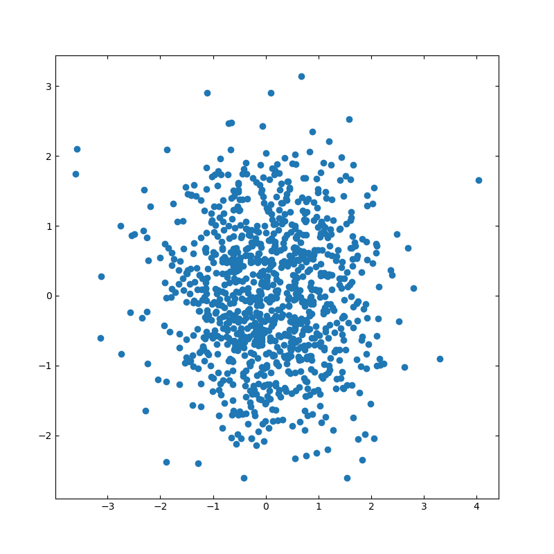
import numpy as np
import matplotlib.pyplot as plt
# 散布図のシード値
np.random.seed(19680801)
# 描画用のランダムデータを作成
x = np.random.randn(1000)
y = np.random.randn(1000)
# 軸の設定
left, width = 0.1, 0.8
bottom, height = 0.1, 0.8
spacing = 0.005
rect_scatter = [left, bottom, width, height]
# 描画サイズの設定
plt.figure(figsize=(8, 8))
ax_scatter = plt.axes(rect_scatter)
ax_scatter.tick_params(direction='in', top=True, right=True)
# 散布図の設定
ax_scatter.scatter(x, y)
plt.show()
■ヒストグラム付きの散布図
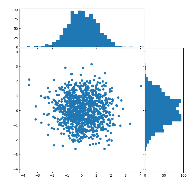
import numpy as np
import matplotlib.pyplot as plt
# Fixing random state for reproducibility
np.random.seed(19680801)
# the random data
x = np.random.randn(1000)
y = np.random.randn(1000)
# definitions for the axes
left, width = 0.1, 0.65
bottom, height = 0.1, 0.65
spacing = 0.005
rect_scatter = [left, bottom, width, height]
rect_histx = [left, bottom + height + spacing, width, 0.2]
rect_histy = [left + width + spacing, bottom, 0.2, height]
# 描画位置の指定
plt.figure(figsize=(8, 8))
ax_scatter = plt.axes(rect_scatter)
ax_scatter.tick_params(direction='in', top=True, right=True)
ax_histx = plt.axes(rect_histx)
ax_histx.tick_params(direction='in', labelbottom=False)
ax_histy = plt.axes(rect_histy)
ax_histy.tick_params(direction='in', labelleft=False)
# 描画する散布図データ
ax_scatter.scatter(x, y)
# 描画サイズを指定する
binwidth = 0.25
lim = np.ceil(np.abs([x, y]).max() / binwidth) * binwidth
ax_scatter.set_xlim((-lim, lim))
ax_scatter.set_ylim((-lim, lim))
bins = np.arange(-lim, lim + binwidth, binwidth)
ax_histx.hist(x, bins=bins)
ax_histy.hist(y, bins=bins, orientation='horizontal')
ax_histx.set_xlim(ax_scatter.get_xlim())
ax_histy.set_ylim(ax_scatter.get_ylim())
plt.show()
【このカテゴリーの最新記事】
この記事へのコメント
コメントを書く
この記事へのトラックバックURL
https://fanblogs.jp/tb/10226733
※ブログオーナーが承認したトラックバックのみ表示されます。
この記事へのトラックバック