2020年09月25日
python:matplotlibの覚書:棒グラフ
matplotlibとは
pythonの標準ライブラリでグラフの描画に利用する
matplotlib使い方
よく使うグラフの簡単な使い方を記載しておく。
参考:公式サイトの描画例
幅広い描画方法を記載してあるため、参考になる。
サイトリンク
棒グラフ
基本
matplotlib.pyplot.bar(x, height, width=0.5, bottom=None, align='center', **kwargs)
リファレンス- x:float または array
棒グラフで描画するx軸の項目。 - height:float または array
各棒グラフの高さ。 - width:float または array
デフォルト値は0.8。各棒グラフの幅。 - bottom:float または array
デフォルト値は0。 - align:['center', 'edge']
デフォルト値は'center'。各棒グラフのボトム(下側)の値 - **kwargs
その他の設定項目。 - color:color または colorリスト
棒グラフの塗りつぶし色 - edgecolor:color または colorリスト
棒グラフの枠色 - xerr, yerr:float または array(形状は(N,)または(2,N)形状。)
誤差分散値
描画例
■基本的な描画
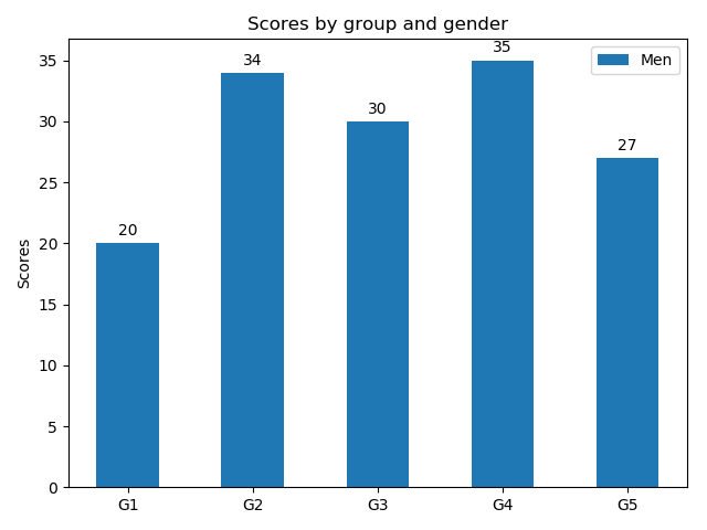
import matplotlib
import matplotlib.pyplot as plt
import numpy as np
labels = ['G1', 'G2', 'G3', 'G4', 'G5']
men_means = [20, 34, 30, 35, 27]
x = np.arange(len(labels)) # ラベル位置
width = 0.5 # 棒グラフの幅
fig, ax = plt.subplots()
rects1 = ax.bar(x, men_means, width, label='Men')
# ラベルとタイトルのセット
ax.set_ylabel('Scores')
ax.set_title('Scores by group and gender')
ax.set_xticks(x)
ax.set_xticklabels(labels)
ax.legend()
fig.tight_layout()
plt.show()
■グループ描画
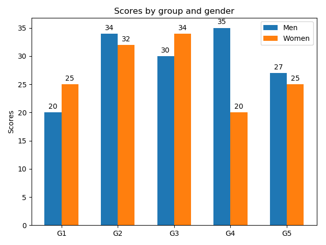
棒グラフの幅を半分にして、横位置をグラフ幅の半分だけ左右にずらして描画している。ずらす量を調整することで、3グループ以上も描画可能。
import matplotlib
import matplotlib.pyplot as plt
import numpy as np
labels = ['G1', 'G2', 'G3', 'G4', 'G5']
men_means = [20, 34, 30, 35, 27]
women_means = [25, 32, 34, 20, 25]
x = np.arange(len(labels)) # ラベル位置
width = 0.3 # 棒グラフの幅
fig, ax = plt.subplots()
rects1 = ax.bar(x - width/2, men_means, width, label='Men')
rects2 = ax.bar(x + width/2, women_means, width, label='Women')
# ラベルとタイトルのセット
ax.set_ylabel('Scores')
ax.set_title('Scores by group and gender')
ax.set_xticks(x)
ax.set_xticklabels(labels)
ax.legend()
fig.tight_layout()
plt.show()
■積み上げグラフの描画
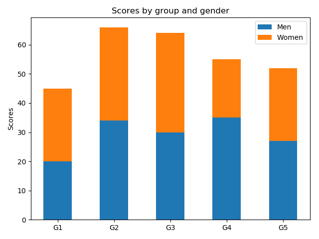
積み上げる棒グラフの底(bottom)に他方のグラフの高さを設定する。
import matplotlib
import matplotlib.pyplot as plt
import numpy as np
labels = ['G1', 'G2', 'G3', 'G4', 'G5']
men_means = [20, 34, 30, 35, 27]
women_means = [25, 32, 34, 20, 25]
x = np.arange(len(labels)) # ラベル位置
width = 0.5 # 棒グラフの幅
fig, ax = plt.subplots()
rects1 = ax.bar(, men_means, width, label='Men')
rects2 = ax.bar(x, women_means, width, label='Women',bottom=men_means)
# ラベルとタイトルのセット
ax.set_ylabel('Scores')
ax.set_title('Scores by group and gender')
ax.set_xticks(x)
ax.set_xticklabels(labels)
ax.legend()
fig.tight_layout()
plt.show()
■横向きの棒グラフの描画
import matplotlib
import matplotlib.pyplot as plt
import numpy as np
labels = ['G1', 'G2', 'G3', 'G4', 'G5']
men_means = [20, 34, 30, 35, 27]
x = np.arange(len(labels)) # ラベル位置
width = 0.5 # 棒グラフの幅
fig, ax = plt.subplots()
rects1 = ax.barh(x, men_means, width, label='Men')
# ラベルとタイトルのセット
ax.set_ylabel('Scores')
ax.set_title('Scores by group and gender')
ax.set_yticks(x)
ax.set_yticklabels(labels)
ax.legend()
fig.tight_layout()
plt.show()
【このカテゴリーの最新記事】
-
no image
-
no image
-
no image
-
no image
-
no image
この記事へのコメント
コメントを書く
この記事へのトラックバックURL
https://fanblogs.jp/tb/10221592
※ブログオーナーが承認したトラックバックのみ表示されます。
この記事へのトラックバック