新規記事の投稿を行うことで、非表示にすることが可能です。
2018年07月22日
《その427》DirectX11アプリ(ユニバーサルWindows)
DirectX11アプリ(ユニバーサルWindows)
ファイル(F) -> 新規作成(N) -> プロジェクト(P)
Visual C++ -> Windowsユニバーサル -> DirectX11アプリ(ユニバーサルWindows)
の順に操作します。
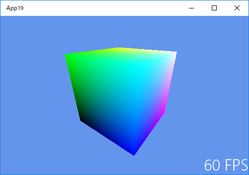
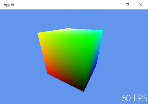
VS2017 を、このようにして開始すると、3Dアニメーションのサンプルアプリが自動作成されます。
自分の場合、3Dアニメーション や DirectX11 の知識が完全にゼロです。基礎的なことから徐々に知識を積み上げていくやり方で進むには、気力・能力ともに不足していると自覚しているため、とりあえず、このサンプルアプリを手掛かりにして調べていくことにします。
このサンプルアプリは、
・F5キー
・Ctrlキー + F5キー
等の操作でスタートさせると、キレイな立方体の画像が回転します。
しかし・・・、たくさんのファイルがあって、なにがどうなっているのか 全体を理解するのはムリなので、とりあえず確認できる部分から見ていきたいと思います。
最初に コンテンツとして分類されている
Sample3DSceneRenderer.h
と
Sample3DSceneRenderer.cpp
を見てみます。
頂点データや光源の位置などから表示画像を生成するための一連の手順は、レンダリングパイプラインと呼ばれますが、
Sample3DSceneRenderer.h と Sample3DSceneRenderer.cpp は、レンダリングパイプラインにより画像をインスタンス化するレンダラーらしいです。
三角形が連結した三角形メッシュを用いて立体を表現しますが、次のコードは、メッシュの頂点の位置と色を指定しています。
static const VertexPositionColor cubeVertices[] =
{
    {XMFLOAT3(-0.5f, -0.5f, -0.5f), XMFLOAT3(0.0f, 0.0f, 0.0f)},  // 頂点0
    {XMFLOAT3(-0.5f, -0.5f,  0.5f), XMFLOAT3(0.0f, 0.0f, 1.0f)},  // 頂点1
    {XMFLOAT3(-0.5f,  0.5f, -0.5f), XMFLOAT3(0.0f, 1.0f, 0.0f)},  // 頂点2
    {XMFLOAT3(-0.5f,  0.5f,  0.5f), XMFLOAT3(0.0f, 1.0f, 1.0f)},  // 頂点3
    {XMFLOAT3( 0.5f, -0.5f, -0.5f), XMFLOAT3(1.0f, 0.0f, 0.0f)},  // 頂点4
    {XMFLOAT3( 0.5f, -0.5f,  0.5f), XMFLOAT3(1.0f, 0.0f, 1.0f)},  // 頂点5
    {XMFLOAT3( 0.5f,  0.5f, -0.5f), XMFLOAT3(1.0f, 1.0f, 0.0f)},  // 頂点6
    {XMFLOAT3( 0.5f,  0.5f,  0.5f), XMFLOAT3(1.0f, 1.0f, 1.0f)},  // 頂点7
};
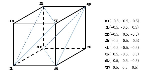
例えば、
頂点0 の場合
座標は (-0.5f, -0.5f, -0.5f)
色は (0.0f, 0.0f, 0.0f)、すなわち RGB(Red, Green, Blue) が 0,0,0 ですから黒色
頂点1 の場合
座標は (-0.5f, -0.5f, 0.5f)
色は (0.0f, 0.0f, 1.0f)、すなわち RGB が 0,0,1 ですから青色
頂点2 の場合
座標は (-0.5f, 0.5f, -0.5f)
色は (0.0f, 1.0f, 0.0f)、すなわち RGB が 0,1,0 ですから緑色
といった具合です。
また、次のコードは三角形メッシュを具体的に表します。
static const unsigned short cubeIndices [] =
{
    0,2,1, // -x
    1,2,3,

    4,5,6, // +x
    5,7,6,

    0,1,5, // -y
    0,5,4,

    2,6,7, // +y
    2,7,3,

    0,4,6, // -z
    0,6,2,

    1,3,7, // +z
    1,7,5,
};
最初の 三角形021,三角形123 は頂点の順番が 反時計回りになっています。DirectX では、これは、裏面であることを意味します。
また、三角形456,三角形576 は頂点の順番が 時計回りになっています。これは、この面が表面であることを意味します。
Sample3DSceneRenderer.cpp は VS2017 に組み込まれているサンプルアプリのプログラムなので、ここでは 全体のプログラムの掲載は省略します。必要な場合は VS2017 で確認してください。
2018年07月09日
《その426》Contentプロパティ
Contentプロパティ
Button要素や Label要素など、Contentプロパティを持つ要素の場合、その Contentプロパティに任意の型の子要素を設定することができます。
<Button>
<Button.Content>
<TextBlock Text="あいうえお"/>
</Button.Content>
</Button>
この例の場合であれば、<Button.Content>タグを省略して、
<Button>
<TextBlock Text="あいうえお"/>
</Button>
のように記述することもできます。
また、パネル要素を使用することで、複数の子要素を設定することも可能です。
例えば、下記の MainPage.xaml にあるコード、
<Button x:Name="button2" HorizontalAlignment="Left"
Margin="270,40,0,0" VerticalAlignment="Top" Height="180"
Width="180" Padding="0" Click="button2_Click">
<StackPanel Height="180" Width="180">
<Image x:Name="image01" HorizontalAlignment="Left" Height="60"
Margin="10,10,0,0" VerticalAlignment="Top" Width="80"
Source="pic01.jpg"/>
<Image x:Name="image04" HorizontalAlignment="Left" Height="60"
Margin="90,0,0,0" VerticalAlignment="Top" Width="80"
Source="pic04.jpg"/>
<TextBlock x:Name="textBlock2" HorizontalAlignment="Left"
Margin="48,10,0,0" Text="ボタンB" TextWrapping="Wrap"
VerticalAlignment="Top"
FontFamily="Goudy Stout" FontSize="24"/>
</StackPanel>
</Button>
においては、
<Button>
<StackPanel>
<Image/>
<Image/>
<TextBlock/>
</StackPanel>
</Button>
の形で、Button要素に 3つの子要素を持たせています。
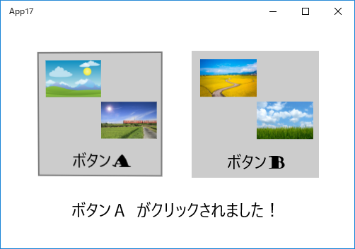
今回のアプリの開始画面です。
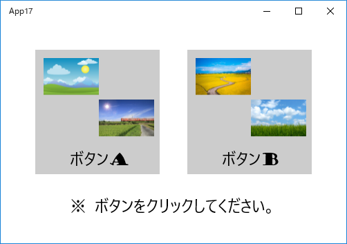
ボタンA をクリックしました。
以下は、MainPage.xaml のコードです。
<Page
    x:Class="App17.MainPage"
    xmlns="http://schemas.microsoft.com/winfx/2006/xaml/presentation"
    xmlns:x="http://schemas.microsoft.com/winfx/2006/xaml"
    xmlns:local="using:App17"
    xmlns:d="http://schemas.microsoft.com/expression/blend/2008"
    xmlns:mc="http://schemas.openxmlformats.org/markup-compatibility/2006"
    mc:Ignorable="d">

    <Grid Background="{ThemeResource ApplicationPageBackgroundThemeBrush}">
        <Button x:Name="button1" HorizontalAlignment="Left"
                    Margin="50,40,0,0" VerticalAlignment="Top" Height="180"
                    Width="180" Padding="0" Click="button1_Click">
            <StackPanel Height="180" Width="180">
                <Image x:Name="image1" HorizontalAlignment="Left" Height="60"
                       Margin="10,10,0,0" VerticalAlignment="Top" Width="80"
                       Source="pic02.jpg"/>
                <Image x:Name="image2" HorizontalAlignment="Left" Height="60"
                       Margin="90,0,0,0" VerticalAlignment="Top" Width="80"
                       Source="pic03.jpg"/>
                <TextBlock x:Name="textBlock1" HorizontalAlignment="Left"
                       Margin="48,10,0,0" Text="ボタンA" TextWrapping="Wrap"
                       VerticalAlignment="Top"
                       FontFamily="Goudy Stout" FontSize="24"/>
            </StackPanel>
        </Button>

        <Button x:Name="button2" HorizontalAlignment="Left"
                    Margin="270,40,0,0" VerticalAlignment="Top" Height="180"
                    Width="180" Padding="0" Click="button2_Click">
            <StackPanel Height="180" Width="180">
                <Image x:Name="image01" HorizontalAlignment="Left" Height="60"
                       Margin="10,10,0,0" VerticalAlignment="Top" Width="80"
                       Source="pic01.jpg"/>
                <Image x:Name="image04" HorizontalAlignment="Left" Height="60"
                       Margin="90,0,0,0" VerticalAlignment="Top" Width="80"
                       Source="pic04.jpg"/>
                <TextBlock x:Name="textBlock2" HorizontalAlignment="Left"
                       Margin="48,10,0,0" Text="ボタンB" TextWrapping="Wrap"
                       VerticalAlignment="Top"
                       FontFamily="Goudy Stout" FontSize="24"/>
            </StackPanel>
        </Button>

        <TextBlock x:Name="textBlock3" HorizontalAlignment="Left"
                   Margin="100,250,0,0"
                   Text="※ ボタンをクリックしてください。"
                   TextWrapping="Wrap" VerticalAlignment="Top"
                   FontFamily="Goudy Stout" FontSize="24"/>

    </Grid>
</Page>
以下は、MainPage.xaml.cpp のコードです。
//
// MainPage.xaml.cpp
// MainPage クラスの実装。
//

#include "pch.h"
#include "MainPage.xaml.h"

using namespace App17;

using namespace Platform;
using namespace Windows::Foundation;
using namespace Windows::Foundation::Collections;
using namespace Windows::UI::Xaml;
using namespace Windows::UI::Xaml::Controls;
using namespace Windows::UI::Xaml::Controls::Primitives;
using namespace Windows::UI::Xaml::Data;
using namespace Windows::UI::Xaml::Input;
using namespace Windows::UI::Xaml::Media;
using namespace Windows::UI::Xaml::Navigation;
using namespace Platform;


MainPage::MainPage()
{
    InitializeComponent();
}


void App17::MainPage::button1_Click(Object^ sender, RoutedEventArgs^ e)
{
    textBlock3->Text = "ボタンA がクリックされました!";
}


void App17::MainPage::button2_Click(Object^ sender, RoutedEventArgs^ e)
{
    textBlock3->Text = "ボタンB がクリックされました!";
}
《その425》MapControl
MapControl
MapControl は地図を表示します。
MapControl自体は、
表示(V) -> ツールボックス(X)
から ドラッグ&ドロップで簡単に設置できるのですが、これを使えるようにするには
マップ認証キーを入手する必要があります。
マップ認証キーの入手方法の解説は ここ
マップ認証キーの入手先は ここ です。
MapControl には たくさんの機能がありますが、今回は、ツールボックスからドラッグ&ドロップした基本状態のままで使用しています。
付け加えたのは、道路地図・航空写真 を選択するためのボタンと、拡大・縮小 のためのスライダーだけです。
基本状態のままでも、ドラッグによる地図範囲の移動 や ダブルクリックによる拡大 などが可能です。スライダーは縮小用として設置したのですが、もちろん拡大用にも使えます。
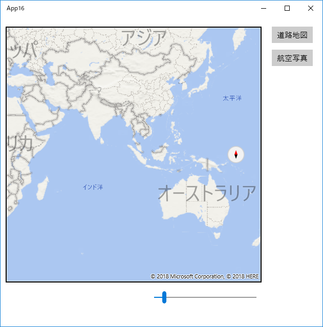
アプリ開始画面です。
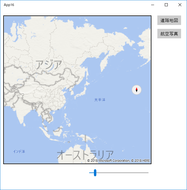
ドラッグして、日本を中央に持ってきました。
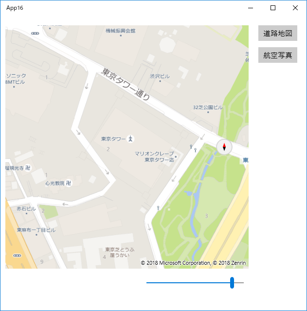
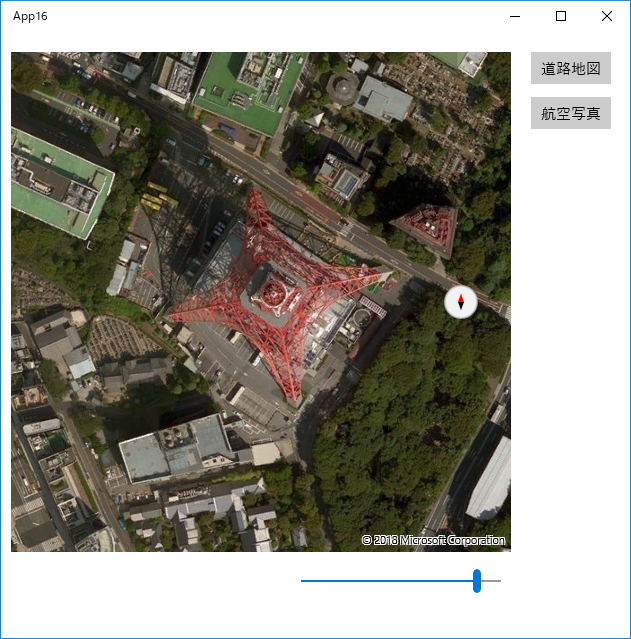
東京タワー発見!
航空写真に切りかえました。
以下は、MainPage.xaml のコードです。
<Page
    xmlns="http://schemas.microsoft.com/winfx/2006/xaml/presentation"
    xmlns:x="http://schemas.microsoft.com/winfx/2006/xaml"
    xmlns:local="using:App16"
    xmlns:d="http://schemas.microsoft.com/expression/blend/2008"
    xmlns:mc="http://schemas.openxmlformats.org/markup-compatibility/2006"
    xmlns:Custom="using:Windows.UI.Xaml.Controls.Maps"
    x:Class="App16.MainPage"
    mc:Ignorable="d">

    <Grid Background="{ThemeResource ApplicationPageBackgroundThemeBrush}">

        <Custom:MapControl x:Name="mapControl" HorizontalAlignment="Left"
            Margin="10,20,0,0" VerticalAlignment="Top"  Width="500" Height="500"
            ZoomLevel ="1" Style="Road" RotateInteractionMode="GestureAndControl"
            ZoomLevelChanged="mapControl_ZoomLevelChanged"
            MapServiceToken="####################################"/>
            <!-- ↑ 取得した MapServiceToken(マップ認証キー)を記入します。-->

        <Button x:Name="button1" Content="道路地図" HorizontalAlignment="Left"
            Margin="530,20,0,0" VerticalAlignment="Top" Click="button1_Click"/>

        <Button x:Name="button2" Content="航空写真" HorizontalAlignment="Left"
            Margin="530,65,0,0" VerticalAlignment="Top" Click="button2_Click"/>

        <Slider x:Name="slider" HorizontalAlignment="Left" Margin="300,530,0,0"
            Minimum="1" Maximum="20" Value="1" Width="200" VerticalAlignment="Top"
            ValueChanged="slider_ValueChanged"/>

    </Grid>
</Page>
以下は、MainPage.xaml.cpp のコードです。
//
// MainPage.xaml.cpp
// MainPage クラスの実装。
//

#include "pch.h"
#include "MainPage.xaml.h"

using namespace App16;

using namespace Platform;
using namespace Windows::Foundation;
using namespace Windows::Foundation::Collections;
using namespace Windows::UI::Xaml;
using namespace Windows::UI::Xaml::Controls;
using namespace Windows::UI::Xaml::Controls::Primitives;
using namespace Windows::UI::Xaml::Data;
using namespace Windows::UI::Xaml::Input;
using namespace Windows::UI::Xaml::Media;
using namespace Windows::UI::Xaml::Navigation;


MainPage::MainPage()
{
    InitializeComponent();
}


void App16::MainPage::button1_Click(Platform::Object^ sender, RoutedEventArgs^ e)
{
    mapControl->Style = Maps::MapStyle::Road;       // 道路地図
}


void App16::MainPage::button2_Click(Platform::Object^ sender, RoutedEventArgs^ e)
{
    mapControl->Style = Maps::MapStyle::Aerial;     // 航空写真
}


// スライダーで地図の拡大・縮小をします。
void App16::MainPage::slider_ValueChanged(Platform::Object^ sender,
    Controls::Primitives::RangeBaseValueChangedEventArgs^ e)
{
    mapControl->ZoomLevel = slider->Value;
}


// ダブルクリックで地図が拡大された時に、
//        それに連動して スライダーが動くようにします。
void App16::MainPage::mapControl_ZoomLevelChanged(Maps::MapControl^ sender,
    Platform::Object^ args)
{
    slider->Value = mapControl->ZoomLevel;
}
2018年07月07日
《その424》ProgressRingコントロール
ProgressRingコントロール
ProgressRing等のプログレスコントロールは、時間のかかる作業が進行中であることを示します。
下記の例では、標準色の水色を赤色に変えて、サイズを少し大きくしてあります。
ProgressRingの動作を開始させるコードは、
progressRing->IsActive = true;
動作終了は、
progressRing->IsActive = false;
です。
コントロールの配置状況です。
(左から ProgressRing, Button, TextBox の順)
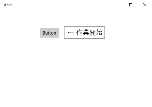
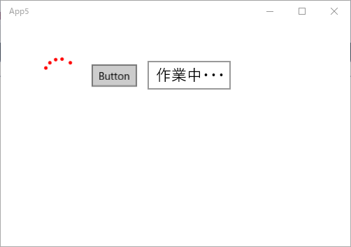
アプリの開始画面です。
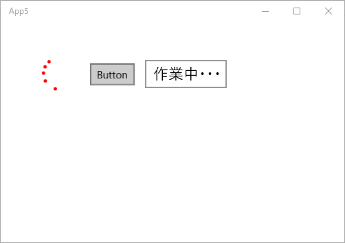
ボタンをクリックしました。時間のかかる作業が進行中です。
実際には、Sleep(5000) で 代用しています (;^_^A)
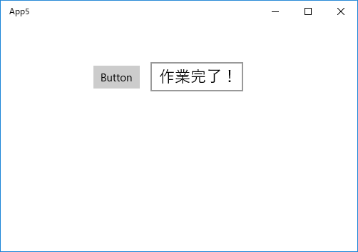
作業が完了しました。
以下は、MainPage.xaml のコードです。
<Page
    x:Class="App5.MainPage"
    xmlns="http://schemas.microsoft.com/winfx/2006/xaml/presentation"
    xmlns:x="http://schemas.microsoft.com/winfx/2006/xaml"
    xmlns:local="using:App5"
    xmlns:d="http://schemas.microsoft.com/expression/blend/2008"
    xmlns:mc="http://schemas.openxmlformats.org/markup-compatibility/2006"
    mc:Ignorable="d">

    <Grid Background="{ThemeResource ApplicationPageBackgroundThemeBrush}">
        <ProgressRing x:Name="progressRing" HorizontalAlignment="Left" Margin="60,50,0,0"
                    VerticalAlignment="Top" Width="50" Height="50" Foreground="Red"/>
        <Button x:Name="button" Content="Button" HorizontalAlignment="Left"
                    Margin="130,60,0,0" VerticalAlignment="Top" Click="button_Click"/>
        <TextBox x:Name="textBox" HorizontalAlignment="Left" Margin="210,55,0,0"
                    Text="← 作業開始" VerticalAlignment="Top" FontSize="22"
                    TextChanged="textBox_TextChanged" IsReadOnly="True"/>
    </Grid>
</Page>
以下は、MainPage.xaml.cpp のコードです。
//
// MainPage.xaml.cpp
// MainPage クラスの実装。
//

#include "pch.h"
#include "MainPage.xaml.h"

using namespace App5;

using namespace Platform;
using namespace Windows::Foundation;
using namespace Windows::Foundation::Collections;
using namespace Windows::UI::Xaml;
using namespace Windows::UI::Xaml::Controls;
using namespace Windows::UI::Xaml::Controls::Primitives;
using namespace Windows::UI::Xaml::Data;
using namespace Windows::UI::Xaml::Input;
using namespace Windows::UI::Xaml::Media;
using namespace Windows::UI::Xaml::Navigation;


MainPage::MainPage()
{
    InitializeComponent();
}


// 重い作業(のつもり・・・)
void heavy_work() {
    Sleep(5000);
}


// ボタンクリック・イベントハンドラ
void App5::MainPage::button_Click(Platform::Object^ sender,
    Windows::UI::Xaml::RoutedEventArgs^ e)
{
    // プログレスリングをアクティブにします。
    progressRing->IsActive = true;
    textBox->Text = "作業中・・・";
}


// テキストボックス書換え完了・イベントハンドラ
void App5::MainPage::textBox_TextChanged(Platform::Object^ sender,
    Windows::UI::Xaml::Controls::TextChangedEventArgs^ e)
{
    // 重い作業をします。
    heavy_work();
    textBox->Text = "作業完了!";

    // プログレスリングを非アクティブにします。
    progressRing->IsActive = false;
}
2018年07月04日
《その423》FlipView を利用した画像表示
FlipViewコントロールを利用した画像表示
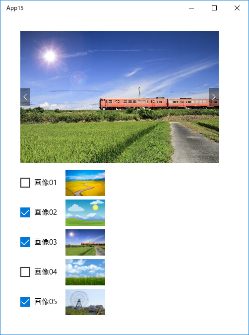
今回のアプリの開始画面です。
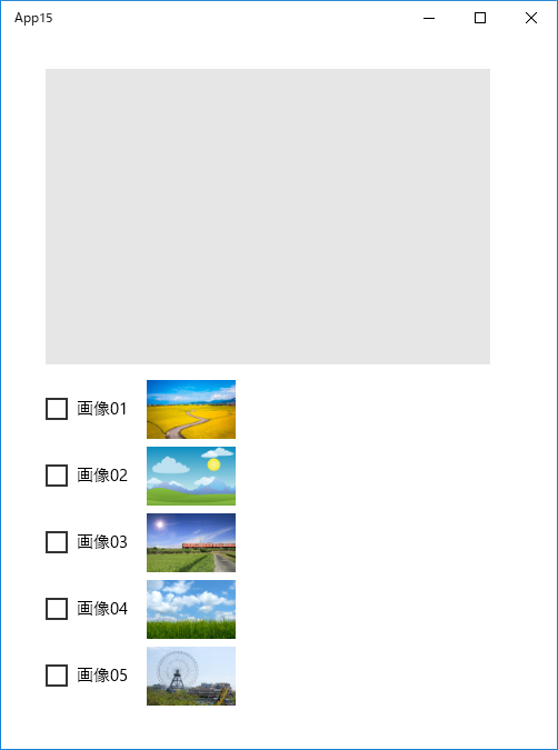
見たい画像にチェックを入れます(最初の画像が表示されます)。
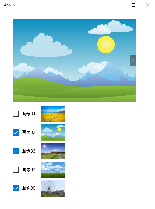
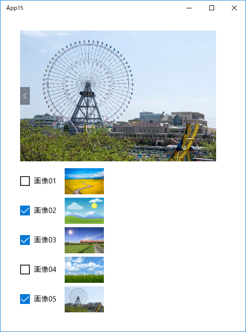
右矢印をクリックして次の画像に移りました。
3枚目の画像です。
画像01 にもチェックを入れました。
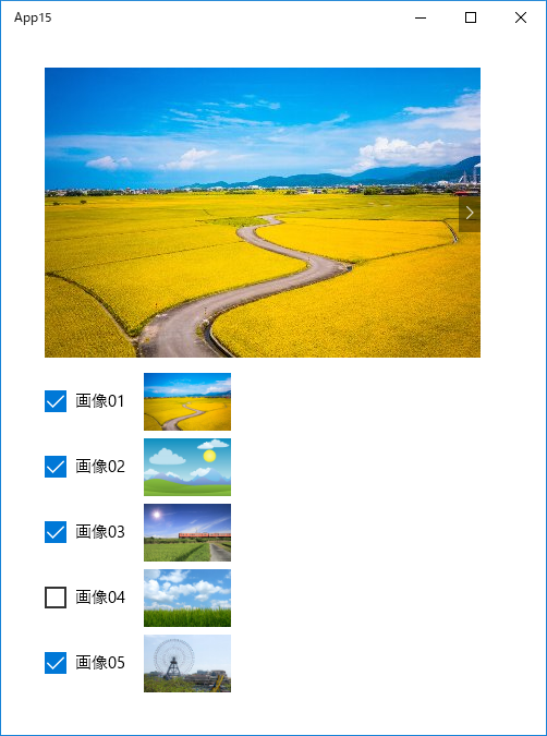
アプリの動作は以上のような感じです。
FlipView は、次のような XAMLコードだけで、完全な動作をするものが生成されますから、手軽に利用することができます。
<FlipView x:Name="flipView" HorizontalAlignment="Left"
VerticalAlignment="Top" Width="400" Height="266">
<Image x:Name="image1" Source="pic01.jpg" />
<Image x:Name="image2" Source="pic02.jpg" />
<Image x:Name="image3" Source="pic03.jpg" />
<Image x:Name="image4" Source="pic04.jpg" />
<Image x:Name="image5" Source="pic05.jpg" />
</FlipView>
今回のアプリでは、上記の FlipViewコントロールと CheckBoxコントロールを利用しました。
下記の C++/CXプログラム MainPage.xaml.cpp では、
CheckBox のチェックの変化をイベントとして捕捉し、画像の表示・非表示を切り替えています。
以下は、MainPage.xaml のコードです。
<Page
    x:Class="App15.MainPage"
    xmlns="http://schemas.microsoft.com/winfx/2006/xaml/presentation"
    xmlns:x="http://schemas.microsoft.com/winfx/2006/xaml"
    xmlns:local="using:App15"
    xmlns:d="http://schemas.microsoft.com/expression/blend/2008"
    xmlns:mc="http://schemas.openxmlformats.org/markup-compatibility/2006"
    mc:Ignorable="d">

    <Grid Background="{ThemeResource ApplicationPageBackgroundThemeBrush}">

        <FlipView x:Name="flipView" HorizontalAlignment="Left" Margin="40,30,0,0"
                  VerticalAlignment="Top" Width="400" Height="266">
            <Image x:Name="image1" Source="pic01.jpg" />
            <Image x:Name="image2" Source="pic02.jpg" />
            <Image x:Name="image3" Source="pic03.jpg" />
            <Image x:Name="image4" Source="pic04.jpg" />
            <Image x:Name="image5" Source="pic05.jpg" />
        </FlipView>

        <CheckBox x:Name="checkBox1" Content="画像01" HorizontalAlignment="Left"
                  Margin="40,320,0,0" VerticalAlignment="Top"
                  Checked="checkBox1_Checked" Unchecked="checkBox1_Unchecked"/>
        <CheckBox x:Name="checkBox2" Content="画像02" HorizontalAlignment="Left"
                  Margin="40,380,0,0" VerticalAlignment="Top"
                  Checked="checkBox2_Checked" Unchecked="checkBox2_Unchecked"/>
        <CheckBox x:Name="checkBox3" Content="画像03" HorizontalAlignment="Left"
                  Margin="40,440,0,0" VerticalAlignment="Top"
                  Checked="checkBox3_Checked" Unchecked="checkBox3_Unchecked"/>
        <CheckBox x:Name="checkBox4" Content="画像04" HorizontalAlignment="Left"
                  Margin="40,500,0,0" VerticalAlignment="Top"
                  Checked="checkBox4_Checked" Unchecked="checkBox4_Unchecked"/>
        <CheckBox x:Name="checkBox5" Content="画像05" HorizontalAlignment="Left"
                  Margin="40,560,0,0" VerticalAlignment="Top"
                  Checked="checkBox5_Checked" Unchecked="checkBox5_Unchecked"/>

        <Image x:Name="s_1" HorizontalAlignment="Left" Height="53"
               Margin="131,310,0,0" VerticalAlignment="Top" Width="80"
               Source="pic01.jpg" Stretch="Fill"/>
        <Image x:Name="s_2" HorizontalAlignment="Left" Height="53"
               Margin="131,370,0,0" VerticalAlignment="Top" Width="80"
               Source="pic02.jpg" Stretch="Fill"/>
        <Image x:Name="s_3" HorizontalAlignment="Left" Height="53"
               Margin="131,430,0,0" VerticalAlignment="Top" Width="80"
               Source="pic03.jpg" Stretch="Fill"/>
        <Image x:Name="s_4" HorizontalAlignment="Left" Height="53"
               Margin="131,490,0,0" VerticalAlignment="Top" Width="80"
               Source="pic04.jpg" Stretch="Fill"/>
        <Image x:Name="s_5" HorizontalAlignment="Left" Height="53"
               Margin="131,550,0,0" VerticalAlignment="Top" Width="80"
               Source="pic05.jpg" Stretch="Fill"/>

    </Grid>

</Page>
以下は、MainPage.xaml.cpp のコードです。
//
// MainPage.xaml.cpp
// MainPage クラスの実装。
//
#include "pch.h"
#include "MainPage.xaml.h"
using namespace App15;
using namespace Platform;
using namespace Windows::Foundation;
using namespace Windows::Foundation::Collections;
using namespace Windows::UI::Xaml;
using namespace Windows::UI::Xaml::Controls;
using namespace Windows::UI::Xaml::Controls::Primitives;
using namespace Windows::UI::Xaml::Data;
using namespace Windows::UI::Xaml::Input;
using namespace Windows::UI::Xaml::Media;
using namespace Windows::UI::Xaml::Navigation;
MainPage::MainPage()
{
InitializeComponent();
flipView->Items->Clear();
}
// f1 〜 f5 : 0 は画像を非表示, 1 は表示
int f1 = 0; // image1
int f2 = 0; // image2
int f3 = 0; // image3
int f4 = 0; // image4
int f5 = 0; // image5
// CheckBox でチェックされた画像を FlipView に登録します。
void MainPage::func1() {
// 最初に、FlipView に登録されている画像をクリアします。
flipView->Items->Clear();
// f1 == 1 ならば、pic01.jpg を FlipView に登録します。
if (f1) {
auto img = ref new Image();
img->Source = ref new Imaging::
BitmapImage(ref new Uri("ms-appx:///pic01.jpg"));
flipView->Items->Append(img);
}
if (f2) {
auto img = ref new Image();
img->Source = ref new Imaging::
BitmapImage(ref new Uri("ms-appx:///pic02.jpg"));
flipView->Items->Append(img);
}
if (f3) {
auto img = ref new Image();
img->Source = ref new Imaging::
BitmapImage(ref new Uri("ms-appx:///pic03.jpg"));
flipView->Items->Append(img);
}
if (f4) {
auto img = ref new Image();
img->Source = ref new Imaging::
BitmapImage(ref new Uri("ms-appx:///pic04.jpg"));
flipView->Items->Append(img);
}
if (f5) {
auto img = ref new Image();
img->Source = ref new Imaging::
BitmapImage(ref new Uri("ms-appx:///pic05.jpg"));
flipView->Items->Append(img);
}
// 上記の「 ms-appx:/// 」はプロジェクト内のパスを表します。
}
// FlipView に何も登録されていない初期状態に戻します。
void MainPage::func2() {
// f1 〜 f5 を全て 0 にします。
f1 = f2 = f3 = f4 = f5 = 0;
// CheckBox のチェックを、すべて外します。
checkBox1->IsChecked = false;
checkBox2->IsChecked = false;
checkBox3->IsChecked = false;
checkBox4->IsChecked = false;
checkBox5->IsChecked = false;
// FlipView に登録されている画像をクリアします。
flipView->Items->Clear();
}
void App15::MainPage::checkBox1_Checked(Platform::
Object^ sender,RoutedEventArgs^ e)
{
f1 = 1;
func1();
}
void App15::MainPage::checkBox1_Unchecked(Platform
::Object^ sender,RoutedEventArgs^ e)
{
func2();
}
void App15::MainPage::checkBox2_Checked(Platform
::Object^ sender,RoutedEventArgs^ e)
{
f2 = 1;
func1();
}
void App15::MainPage::checkBox2_Unchecked(Platform
::Object^ sender,RoutedEventArgs^ e)
{
func2();
}
void App15::MainPage::checkBox3_Checked(Platform
::Object^ sender,RoutedEventArgs^ e)
{
f3 = 1;
func1();
}
void App15::MainPage::checkBox3_Unchecked(Platform::
Object^ sender,RoutedEventArgs^ e)
{
func2();
}
void App15::MainPage::checkBox4_Checked(Platform::
Object^ sender,RoutedEventArgs^ e)
{
f4 = 1;
func1();
}
void App15::MainPage::checkBox4_Unchecked(Platform::
Object^ sender,RoutedEventArgs^ e)
{
func2();
}
void App15::MainPage::checkBox5_Checked(Platform::
Object^ sender,RoutedEventArgs^ e)
{
f5 = 1;
func1();
}
void App15::MainPage::checkBox5_Unchecked(Platform::
Object^ sender,RoutedEventArgs^ e)
{
func2();
}
2018年07月03日
《その422》CalendarDatePicker コントロール
CalendarDatePicker による日付入力
ユーザーに日付入力をしてもらう必要がある場合、CalendarDatePickerコントロールを利用できると便利です。
CalendarDatePickerコントロールの配置は、ツールボックスからフォーム上にドラッグ&ドロップするだけなので容易です。
今回の主要テーマは、CalendarDatePickerコントロールで、ユーザーが選んだ日付を取得する方法です。
下記の MainPage.xaml.cpp で、日付の取得と、取得した日付の表示(TextBlock に表示) を行っています。
最初に、各コントロールを配置します。
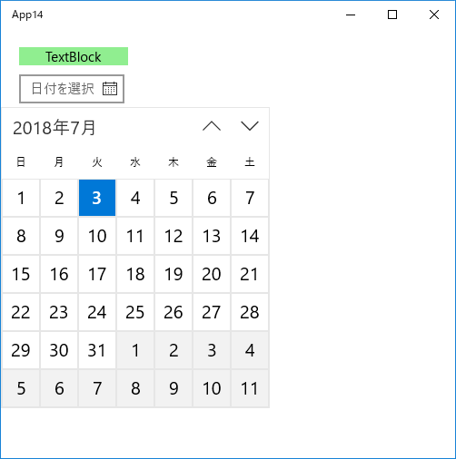
アプリの開始画面です。

CalendarDatePicker をクリックしました(きょうの日付が強調されています)。
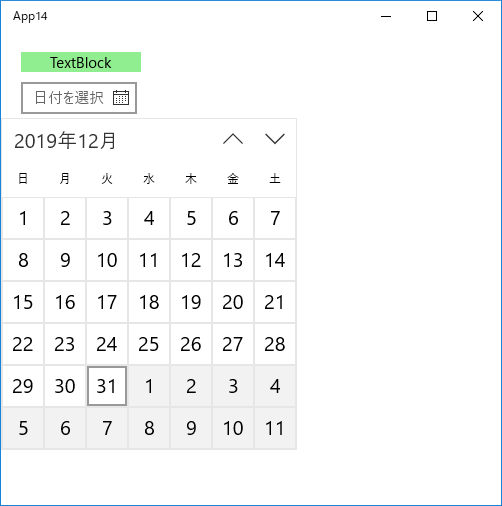
日付を選びます。
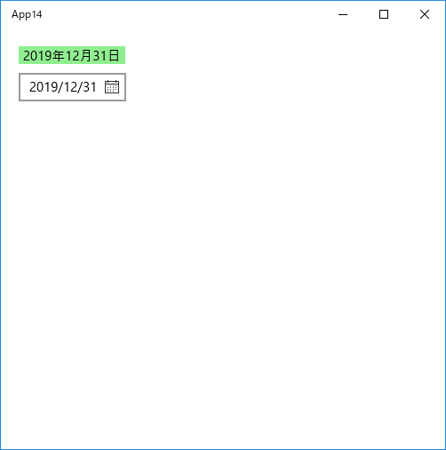
TextBlock に選択した日付が表示されます。
※ CalendarDatePickerコントロールには、自動で選択日付が表示される仕様になっています。
以下は、MainPage.xaml のコードです。
<Page
    x:Class="App14.MainPage"
    xmlns="http://schemas.microsoft.com/winfx/2006/xaml/presentation"
    xmlns:x="http://schemas.microsoft.com/winfx/2006/xaml"
    xmlns:local="using:App14"
    xmlns:d="http://schemas.microsoft.com/expression/blend/2008"
    xmlns:mc="http://schemas.openxmlformats.org/markup-compatibility/2006"
    mc:Ignorable="d">

    <Grid Background="{ThemeResource ApplicationPageBackgroundThemeBrush}">

        <!--TextBlock に背景色を設定したいのですが、TextBlock には
            Backgroundプロパティがありません。
            そのため、ここでは、Borderコントロールを背景色設定に利用
            しました。-->
        <Border HorizontalAlignment="Left" VerticalAlignment="Top"
                Background="Lightgreen" Width="120" Height="20" Margin="20,20,0,0">

            <TextBlock x:Name="textBlock" Text="TextBlock" TextWrapping="Wrap"
                    HorizontalAlignment="Center" VerticalAlignment="Center" />

        </Border>

        <CalendarDatePicker x:Name="calendarDatePicker" HorizontalAlignment="Left"
                Margin="20,50,0,0" VerticalAlignment="Top"
                DateChanged="calendarDatePicker_DateChanged"/>

    </Grid>
</Page>
以下は、MainPage.xaml.cpp のコードです。
//
// MainPage.xaml.cpp
// MainPage クラスの実装。
//

#include "pch.h"
#include "MainPage.xaml.h"

using namespace App14;

using namespace Platform;
using namespace Windows::Foundation;
using namespace Windows::Foundation::Collections;
using namespace Windows::UI::Xaml;
using namespace Windows::UI::Xaml::Controls;
using namespace Windows::UI::Xaml::Controls::Primitives;
using namespace Windows::UI::Xaml::Data;
using namespace Windows::UI::Xaml::Input;
using namespace Windows::UI::Xaml::Media;
using namespace Windows::UI::Xaml::Navigation;

using namespace Windows::Globalization::DateTimeFormatting;


MainPage::MainPage()
{
    InitializeComponent();
}


void App14::MainPage::calendarDatePicker_DateChanged(
    Windows::UI::Xaml::Controls::CalendarDatePicker^ sender,
    Windows::UI::Xaml::Controls::
    CalendarDatePickerDateChangedEventArgs^ args)
{
    DateTime pickedDate = calendarDatePicker->Date->Value;

    // "longdate" or "shortdate"
    auto formatter = ref new DateTimeFormatter("longdate");
    textBlock->Text = formatter->Format(pickedDate);
}
2018年07月02日
《その421》XAML(Grid の詳細設定)
XAML(Grid の詳細設定)
Grid の詳細設定
"auto" の指定
コンテンツのサイズに合わせて列の幅を自動調整します。
<ColumnDefinition Width="auto"/>
コンテンツのサイズに合わせて行の高さを自動調整します。
<RowDefinition Height="auto"/>
"MaxWidth", "MaxHeight" の指定
幅・高さ の上限値を設定します(上限までは自動調整)。
<ColumnDefinition MaxWidth="80"/>
<RowDefinition MaxHeight="80"/>
"*" の指定
「全体幅」から「幅指定列が確保した幅の合計」を引いた残りの幅を、
"*" 指定がある列で 均等割りにします。
<ColumnDefinition Width="*"/>
「全体高さ」から「高さ指定行が確保した高さの合計」を引いた残りの高さを、
"*" 指定がある行で 均等割りにします。
<RowDefinition Height="*"/>
Gridの罫線
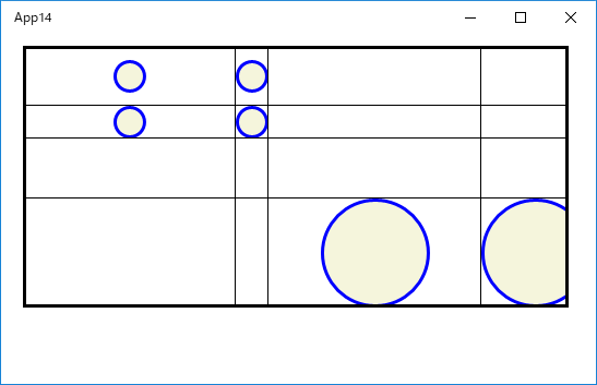
Grid に罫線を引く場合は、Borderコントロールを使います。
<Border BorderBrush="Black" BorderThickness="0,0,3,1"
Grid.Row="1" Grid.Column="3" />
"0,0,3,1" は、罫線の太さを指定しています。
各罫線の太さは、左0, 上0, 右3, 下1 になります。
下記コードの実行結果です。
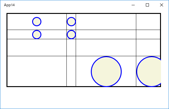
罫線用 Borderコントロールのコードを、円描画コードの後に記述した場合の実行結果です。
以下は、MainPage.xaml のコードです。
<Page
    x:Class="App14.MainPage"
    xmlns="http://schemas.microsoft.com/winfx/2006/xaml/presentation"
    xmlns:x="http://schemas.microsoft.com/winfx/2006/xaml"
    xmlns:local="using:App14"
    xmlns:d="http://schemas.microsoft.com/expression/blend/2008"
    xmlns:mc="http://schemas.openxmlformats.org/markup-compatibility/2006"
    mc:Ignorable="d">

    <Grid VerticalAlignment="Top" HorizontalAlignment="Left" Width="500"
                                            Height="240" Margin="20,10">
        <Grid.ColumnDefinitions>
            <!-- * :「全体幅」から「幅指定列が確保した幅の合計」を引いた
                      残りの幅を、"*" 指定がある列で 均等割りにします。-->
<!--第1列--><ColumnDefinition Width="*"/>
            <!-- auto : コンテンツのサイズに合わせて自動調整 -->
<!--第2列--><ColumnDefinition Width="auto"/>
<!--第3列--><ColumnDefinition Width="*"/>
            <!-- MaxWidth : 幅の上限値(上限までは自動調整)-->
<!--第4列--><ColumnDefinition MaxWidth="80"/>
        </Grid.ColumnDefinitions>
        <Grid.RowDefinitions>
            <!-- * :「全体高さ」から「高さ指定行が確保した高さの合計」を引
                      いた残りの高さを、"*" 指定がある行で 均等割りにします。-->
<!--第1行--><RowDefinition Height="*"/>
<!--第2行--><RowDefinition Height="auto"/>
<!--第3行--><RowDefinition Height="*"/>
<!--第4行--><RowDefinition Height="auto"/>
        </Grid.RowDefinitions>

        <!-- 1行目の枠線設定 -->
        <!-- "3,3,1,1" は「セル枠線の太さ 左3, 上3, 右1, 下1」の指定 -->
        <!-- Grid.Row の指定が無い場合は Grid.Row = "0" -->
        <!-- Grid.Column の指定が無い場合は Grid.Column = "0" -->
        <Border BorderBrush="Black" BorderThickness="3,3,1,1" />
        <Border BorderBrush="Black" BorderThickness="0,3,1,1" Grid.Column="1" />
        <Border BorderBrush="Black" BorderThickness="0,3,1,1" Grid.Column="2" />
        <Border BorderBrush="Black" BorderThickness="0,3,3,1" Grid.Column="3" />

        <!-- 2行目の枠線設定 -->
        <Border BorderBrush="Black" BorderThickness="3,0,1,1" Grid.Row="1" />
        <Border BorderBrush="Black" BorderThickness="0,0,1,1" Grid.Row="1"
                                                           Grid.Column="1" />
        <Border BorderBrush="Black" BorderThickness="0,0,1,1" Grid.Row="1"
                                                           Grid.Column="2" />
        <Border BorderBrush="Black" BorderThickness="0,0,3,1" Grid.Row="1"
                                                           Grid.Column="3" />

        <!-- 3行目の枠線設定 -->
        <Border BorderBrush="Black" BorderThickness="3,0,1,1" Grid.Row="2" />
        <Border BorderBrush="Black" BorderThickness="0,0,1,1" Grid.Row="2"
                                                           Grid.Column="1" />
        <Border BorderBrush="Black" BorderThickness="0,0,1,1" Grid.Row="2"
                                                           Grid.Column="2" />
        <Border BorderBrush="Black" BorderThickness="0,0,3,1" Grid.Row="2"
                                                           Grid.Column="3" />

        <!-- 4行目の枠線設定 -->
        <Border BorderBrush="Black" BorderThickness="3,0,1,3" Grid.Row="3" />
        <Border BorderBrush="Black" BorderThickness="0,0,1,3" Grid.Row="3"
                                                           Grid.Column="1" />
        <Border BorderBrush="Black" BorderThickness="0,0,1,3" Grid.Row="3"
                                                           Grid.Column="2" />
        <Border BorderBrush="Black" BorderThickness="0,0,3,3" Grid.Row="3"
                                                           Grid.Column="3" />

        <Ellipse
            Fill="Beige"
            Height="30"
            Width="30"
            Stroke="Blue"
            StrokeThickness="3"
            Grid.Row="0" Grid.Column="0"
        />

        <Ellipse
            Fill="Beige"
            Height="30"
            Width="30"
            Stroke="Blue"
            StrokeThickness="3"
            Grid.Row="0" Grid.Column="1"
        />

        <Ellipse
            Fill="Beige"
            Height="30"
            Width="30"
            Stroke="Blue"
            StrokeThickness="3"
            Grid.Row="1" Grid.Column="0"
        />

        <Ellipse
            Fill="Beige"
            Height="30"
            Width="30"
            Stroke="Blue"
            StrokeThickness="3"
            Grid.Row="1" Grid.Column="1"
        />

        <Ellipse
            Fill="Beige"
            Height="100"
            Width="100"
            Stroke="Blue"
            StrokeThickness="3"
            Grid.Row="3" Grid.Column="2"
        />

        <Ellipse
            Fill="Beige"
            Height="100"
            Width="100"
            Stroke="Blue"
            StrokeThickness="3"
            Grid.Row="3" Grid.Column="3"
        />

    </Grid>

</Page>
2018年07月01日
《その420》XAML(Grid)
XAML(Grid)
Gridコントロールは、格子状の枠内に子要素を配置することができます。
次の指定で、2行3列の Grid枠が生成され、それぞれの枠内にコントロールを配置することができます。
<Grid VerticalAlignment="Top" HorizontalAlignment="Left"
Width="600" Height="400" Margin="20,10">
<Grid.ColumnDefinitions>
<ColumnDefinition />
<ColumnDefinition />
<ColumnDefinition />
</Grid.ColumnDefinitions>
<Grid.RowDefinitions>
<RowDefinition />
<RowDefinition />
</Grid.RowDefinitions>
</Grid>
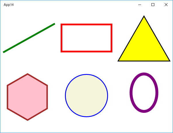
前回《419》は、Canvas に図形を配置しましたが、
下記の MainPage.xaml では、図形を Grid枠内に配置しています。
例えば、六角形の場合は、
Grid.Row="1" Grid.Column="0"
の指定で、2行目の最初の列に置いています。
以下は、MainPage.xaml のコードです。
<Page
    x:Class="App4.MainPage"
    xmlns="http://schemas.microsoft.com/winfx/2006/xaml/presentation"
    xmlns:x="http://schemas.microsoft.com/winfx/2006/xaml"
    xmlns:local="using:App4"
    xmlns:d="http://schemas.microsoft.com/expression/blend/2008"
    xmlns:mc="http://schemas.openxmlformats.org/markup-compatibility/2006"
    mc:Ignorable="d">

    <Grid VerticalAlignment="Top" HorizontalAlignment="Left" Width="600"
                                            Height="400" Margin="20,10">
        <Grid.ColumnDefinitions>
            <ColumnDefinition />
            <ColumnDefinition />
            <ColumnDefinition />
        </Grid.ColumnDefinitions>
        <Grid.RowDefinitions>
            <RowDefinition />
            <RowDefinition />
        </Grid.RowDefinitions>

        <Line
            X1="10" Y1="150"
            X2="190" Y2="50"
            Stroke="Green"
            StrokeThickness="6"
            Grid.Row="0" Grid.Column="0"
        />

        <Rectangle
            Width="180"
            Height="100"
            Stroke="Red"
            StrokeThickness="6"
            Grid.Row="0" Grid.Column="1"
        />

        <Polygon
            Fill="Yellow"
            Points="100,24,10,180,190,180"
            Stroke="Black"
            StrokeThickness="3"
            Grid.Row="0" Grid.Column="2"
        />

        <Polygon
            Fill="Pink"
            Points="70,0,0,40,0,120,70,160,138,120,138,40"
            Stroke="Brown"
            StrokeThickness="5"
            Margin="25,25,0,0"
            Grid.Row="1" Grid.Column="0"
        />

        <Ellipse
            Fill="Beige"
            Height="150"
            Width="150"
            Stroke="Blue"
            StrokeThickness="3"
            Grid.Row="1" Grid.Column="1"
        />

        <Ellipse
            Height="140"
            Width="100"
            Stroke="Purple"
            StrokeThickness="10"
            Grid.Row="1" Grid.Column="2"
        />

    </Grid>

</Page>
編集画面
2018年06月30日
《その419》XAML(図形の描画)
XAML(図形の描画)
C++/CXコードで図形を描画する方法については、本ブログ《380》〜《382》で扱いましたが、今回は、XAML を用いた描画です。
以下は、MainPage.xaml のコードです。
<Page
    x:Class="App14.MainPage"
    xmlns="http://schemas.microsoft.com/winfx/2006/xaml/presentation"
    xmlns:x="http://schemas.microsoft.com/winfx/2006/xaml"
    xmlns:local="using:App14"
    xmlns:d="http://schemas.microsoft.com/expression/blend/2008"
    xmlns:mc="http://schemas.openxmlformats.org/markup-compatibility/2006"
    mc:Ignorable="d">

    <Grid Background="{ThemeResource ApplicationPageBackgroundThemeBrush}">

        <Canvas x:Name="canvas1" HorizontalAlignment="Left" Height="200"
            VerticalAlignment="Top" Width="200" Margin="0,0,0,0">
            <Line
                X1="10" Y1="150"
                X2="190" Y2="50"
                Stroke="Green"
                StrokeThickness="6"
            />
        </Canvas>

        <Canvas x:Name="canvas2" HorizontalAlignment="Left" Height="200"
            VerticalAlignment="Top" Width="200" Margin="200,0,0,0">
            <Rectangle
                Width="180"
                Height="100"
                Stroke="Red"
                StrokeThickness="6"
                Margin="10,50,0,0"
            />
        </Canvas>

        <Canvas x:Name="canvas3" HorizontalAlignment="Left" Height="200"
            VerticalAlignment="Top" Width="200" Margin="400,0,0,0">
            <Polygon
                Fill="Yellow"
                Points="100,24,10,180,190,180"
                Stroke="Black"
                StrokeThickness="3"
            />
        </Canvas>

        <Canvas x:Name="canvas4" HorizontalAlignment="Left" Height="200"
            VerticalAlignment="Top" Width="200" Margin="0,200,0,0">
            <Polygon
                Fill="Pink"
                Points="70,0,0,40,0,120,70,160,138,120,138,40"
                Stroke="Brown"
                StrokeThickness="5"
                Margin="25,25,0,0"
            />
        </Canvas>

        <Canvas x:Name="canvas5" HorizontalAlignment="Left" Height="200"
            VerticalAlignment="Top" Width="200" Margin="200,200,0,0">
            <Ellipse
                Fill="Beige"
                Height="150"
                Width="150"
                Stroke="Blue"
                StrokeThickness="3"
                Margin="25,25,0,0"
            />
        </Canvas>

        <Canvas x:Name="canvas6" HorizontalAlignment="Left" Height="200"
            VerticalAlignment="Top" Width="200" Margin="400,200,0,0">
            <Ellipse
                Height="140"
                Width="100"
                Stroke="Purple"
                StrokeThickness="10"
                Margin="50,20,0,0"
            />
        </Canvas>

    </Grid>

</Page>
《その418》XAML(コントロールの重なり順)
XAML(コントロールの重なり順)
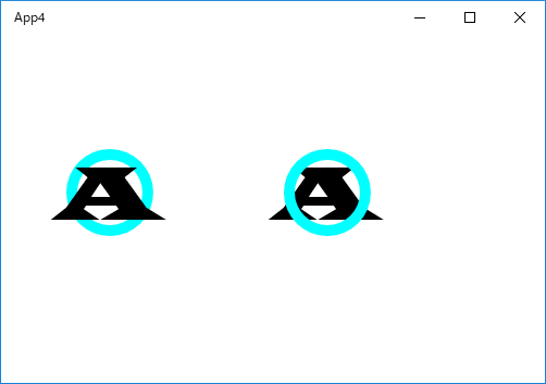
今回のアプリの実行結果画面です。文字と円の重なり順が、左側と右側で、逆になっています。
以下は、MainPage.xaml のコードです。
<Page
    x:Class="App4.MainPage"
    xmlns="http://schemas.microsoft.com/winfx/2006/xaml/presentation"
    xmlns:x="http://schemas.microsoft.com/winfx/2006/xaml"
    xmlns:local="using:App4"
    xmlns:d="http://schemas.microsoft.com/expression/blend/2008"
    xmlns:mc="http://schemas.openxmlformats.org/markup-compatibility/2006"
    mc:Ignorable="d">

    <Grid Background="{ThemeResource ApplicationPageBackgroundThemeBrush}">

        <!-- 円 (左側) 円は MainPage.xaml.cpp で描画しています。-->
        <Canvas x:Name="canvas1" HorizontalAlignment="Left" Height="80"
                Margin="60,105,0,0" VerticalAlignment="Top" Width="80"/>
        <!-- 文字 (左側)  -->
        <TextBlock x:Name="textblock1" HorizontalAlignment="Left" Margin="50,100,0,0"
                Text="A" TextWrapping="Wrap" VerticalAlignment="Top"
                FontFamily="Wide Latin" FontSize="72"/>

        <!-- 文字 (右側)  -->
        <TextBlock x:Name="textblock2" HorizontalAlignment="Left" Margin="250,100,0,0"
                Text="A" TextWrapping="Wrap" VerticalAlignment="Top"
                FontFamily="Wide Latin" FontSize="72"/>
        <!-- 円 (右側) 円は MainPage.xaml.cpp で描画しています。-->
        <Canvas x:Name="canvas2" HorizontalAlignment="Left" Height="80"
                Margin="260,105,0,0" VerticalAlignment="Top" Width="80"/>

    </Grid>
</Page>
Pageコントロールの中に 1つの Grigコントロールが入っています。
そして、その Gridコントロール内に Canvasコントロールが2つ、TextBlockコントロールが2つ入っています。
Pageタグの中の記述、
xmlns="http://schemas.microsoft.com/winfx/2006/xaml/presentation"
xmlns:x="http://schemas.microsoft.com/winfx/2006/xaml"
xmlns:local="using:App4"
xmlns:d="http://schemas.microsoft.com/expression/blend/2008"
xmlns:mc="http://schemas.openxmlformats.org/markup-compatibility/2006"
は、XML名前空間の宣言です。
xmlns は、XML名前空間の指定を意味していますが、ここを手動で書きかえることはないと思うので、気にする必要はないと思います。
上の XAMLコードでは、
<!-- 円 (左側) 円は MainPage.xaml.cpp で描画しています。-->
<Canvas x:Name="canvas1" HorizontalAlignment="Left" Height="80"
Margin="60,105,0,0" VerticalAlignment="Top" Width="80"/>
<!-- 文字 (左側) -->
<TextBlock x:Name="textblock1" HorizontalAlignment="Left" Margin="50,100,0,0"
Text="A" TextWrapping="Wrap" VerticalAlignment="Top"
FontFamily="Wide Latin" FontSize="72"/>
<!-- 文字 (右側) -->
<TextBlock x:Name="textblock2" HorizontalAlignment="Left" Margin="250,100,0,0"
Text="A" TextWrapping="Wrap" VerticalAlignment="Top"
FontFamily="Wide Latin" FontSize="72"/>
<!-- 円 (右側) 円は MainPage.xaml.cpp で描画しています。-->
<Canvas x:Name="canvas2" HorizontalAlignment="Left" Height="80"
Margin="260,105,0,0" VerticalAlignment="Top" Width="80"/>
のように、記述の順序が、
円,文字 の順
文字,円 の順
の2通りになっています。
※ C++/CXコードでの図形描画については、本ブログ《380》〜《382》で扱っています。
◆ 円,文字 の順 ・・・ 円の上に文字が乗ります。
◆ 文字,円 の順 ・・・ 文字の上に円が乗ります。
つまり、後方に記述されたコントロールが上になるように表示されるわけです。
以下は、MainPage.xaml.cpp のコードです。
//
// MainPage.xaml.cpp
// MainPage クラスの実装。
//

#include "pch.h"
#include "MainPage.xaml.h"

using namespace App4;

using namespace Platform;
using namespace Windows::Foundation;
using namespace Windows::Foundation::Collections;
using namespace Windows::UI::Xaml;
using namespace Windows::UI::Xaml::Controls;
using namespace Windows::UI::Xaml::Controls::Primitives;
using namespace Windows::UI::Xaml::Data;
using namespace Windows::UI::Xaml::Input;
using namespace Windows::UI::Xaml::Media;
using namespace Windows::UI::Xaml::Navigation;


MainPage::MainPage()
{
    InitializeComponent();

    // 円の描画
    auto circle1 = ref new Shapes::Ellipse();
    circle1->Width = 80; circle1->Height = 80;
    circle1->Stroke
        = ref new SolidColorBrush(Windows::UI::Colors::Aqua);
    circle1->StrokeThickness = 10;
    canvas1->Children->Append(circle1);

    // 円の描画
    auto circle2 = ref new Shapes::Ellipse();
    circle2->Width = 80; circle2->Height = 80;
    circle2->Stroke
        = ref new SolidColorBrush(Windows::UI::Colors::Aqua);
    circle2->StrokeThickness = 10;
    canvas2->Children->Append(circle2);
}
