新規記事の投稿を行うことで、非表示にすることが可能です。
2022年06月05日
python:ジェネレータ関数(複数の配列を組み合わせる)
配列から要素の抽出・フィルタリング
inputWords:入力文字列
【コード】
import itertools
inputWords = "あいう"
print("要素を順につなげる")
print(list(itertools.chain(enumerate(inputWords),inputWords)))
print("多重配列を要素を順につなげ単配列にする")
print(list(itertools.chain.from_iterable(enumerate(inputWords))))
print("要素のデカルト積.repeatで配列の繰り返し数を指定する")
print(list(itertools.product(inputWords,repeat=2)))
print(list(itertools.product(inputWords,inputWords)))
print("複数の配列から並列して要素を取得. 一番短い配列の要素に合わせて終了する")
print(list(zip(inputWords,[1,2])))
print("複数の配列から並列して要素を取得. 一番長い配列の要素に合わせる. fillvalueの指定がなければNone.")
print(list(itertools.zip_longest(inputWords,[1,2])))
【出力結果】
要素を順につなげる
[(0, 'あ'), (1, 'い'), (2, 'う'), 'あ', 'い', 'う']
多重配列を要素を順につなげ単配列にする
[0, 'あ', 1, 'い', 2, 'う']
要素のデカルト積.repeatで配列の繰り返し数を指定する
[('あ', 'あ'), ('あ', 'い'), ('あ', 'う'), ('い', 'あ'), ('い', 'い'), ('い', 'う'), ('う', 'あ'), ('う', 'い'), ('う', 'う')]
[('あ', 'あ'), ('あ', 'い'), ('あ', 'う'), ('い', 'あ'), ('い', 'い'), ('い', 'う'), ('う', 'あ'), ('う', 'い'), ('う', 'う')]
複数の配列から並列して要素を取得. 一番短い配列の要素に合わせて終了する
[('あ', 1), ('い', 2)]
複数の配列から並列して要素を取得. 一番長い配列の要素に合わせる. fillvalueの指定がなければNone.
[('あ', 1), ('い', 2), ('う', None)]
【このカテゴリーの最新記事】
-
no image
-
no image
-
no image
-
no image
-

2022年05月07日
python:ジェネレータ関数(マッピング)
配列の要素マッピング
inputWords:入力配列
my_func:計算用関数
【コード】
import itertools
def my_func(a,b):
return a * 2 + b
inputList = [1,3,5,7,9,2,4,6,8,10]
print("配列の前から累積和を計算")
print(list(itertools.accumulate(inputList)))
print("配列の前から my_func を計算")
print(list(itertools.accumulate(inputList,my_func)))
print("配列の前から (index, item)のタプルを出力. 第2引数にindexの開始番号を指定可能. デフォルト0開始")
print(list(enumerate(inputList)))
print("配列の前からmy_funcを計算. my_funcの引数の数だけ、mapの引数を追加する必要がある.")
print(list(map(my_func,inputList,inputList)))
print("配列の前からmy_funcを計算. 第2引数は配列. 配列の各要素はmy_funcの引数サイズにする必要がある.")
print(list(itertools.starmap(my_func,enumerate(inputList))))
【出力結果】
配列の前から累積和を計算
[1, 4, 9, 16, 25, 27, 31, 37, 45, 55]
配列の前から my_func を計算
[1, 5, 15, 37, 83, 168, 340, 686, 1380, 2770]
配列の前から (index, item)のタプルを出力. 第2引数にindexの開始番号を指定可能. デフォルト0開始
[(0, 1), (1, 3), (2, 5), (3, 7), (4, 9), (5, 2), (6, 4), (7, 6), (8, 8), (9, 10)]
配列の前からmy_funcを計算. my_funcの引数の数だけ、mapの引数を追加する必要がある.
[3, 9, 15, 21, 27, 6, 12, 18, 24, 30]
配列の前からmy_funcを計算. 第2引数は配列. 配列の各要素はmy_funcの引数サイズにする必要がある.
[1, 5, 9, 13, 17, 12, 16, 20, 24, 28]
2022年05月02日
python:ジェネレータ関数(配列から要素抽出)
配列から要素の抽出・フィルタリング
inputWords:入力文字列。フィルタリング対象
targetWords:フィルタリング用文字
【コード】
import itertools
inputWords = "おはようございます."
def targetWords(char):
return char in "あいうえお"
print("falseとなった要素のみ出力")
print(list(itertools.filterfalse(targetWords,inputWords)))
print("始めてfalseとなった要素以降を出力")
print(list(itertools.dropwhile(targetWords,inputWords)))
print("始めてfalseとなった要素まで出力")
print(list(itertools.takewhile(targetWords,inputWords)))
print("要素をスライスする. 開始と終了")
print(list(itertools.islice(inputWords,2,6)))
print("要素をスライスする. 開始と終了,スキップ")
print(list(itertools.islice(inputWords,2,6,3)))
print("selector_it の True項目のみ出力")
print(list(itertools.compress(inputWords,[0,0,0,1,1])))
【出力結果】
falseとなった要素のみ出力
['は', 'よ', 'ご', 'ざ', 'ま', 'す', '.']
始めてfalseとなった要素以降を出力
['は', 'よ', 'う', 'ご', 'ざ', 'い', 'ま', 'す', '.']
始めてfalseとなった要素まで出力
['お']
要素をスライスする. 開始と終了
['よ', 'う', 'ご', 'ざ']
要素をスライスする. 開始と終了,スキップ
['よ', 'ざ']
selector_it の True項目のみ出力
['う', 'ご']
['は', 'よ', 'ご', 'ざ', 'ま', 'す', '.']
始めてfalseとなった要素以降を出力
['は', 'よ', 'う', 'ご', 'ざ', 'い', 'ま', 'す', '.']
始めてfalseとなった要素まで出力
['お']
要素をスライスする. 開始と終了
['よ', 'う', 'ご', 'ざ']
要素をスライスする. 開始と終了,スキップ
['よ', 'ざ']
selector_it の True項目のみ出力
['う', 'ご']
2021年04月21日
Linuxで動画処理コマンド
動画ファイルの結合
ffmpeg -f concat -i movie_list.txt -c copy output.mp4
movie_list.txtに「file(半角スペース)」に続けて結合したい動画ファイルを1行ずつ記載する。
output.mp4 が出力する動画ファイル。
動画ファイルに音声ファイルを結合する
ffmpeg -i video.mp4 -i music.mp3 -c:v copy -c:a aac -map 0:v:0 -map 1:a:0 output.mp4
video.mp4が音声を付与したい動画ファイル。
music.mp3が音声ファイル。
output.mp4が出力する動画ファイル。
2021年04月20日
Text To Speech (TTS) を IBM Watsonで行う
概要
IBM Watsonは、IBM社が開発したAIです。無料でもAPIのテストなどが行なえます。
Text To Speech(TTS)
Text To Speech とは、文字列を入力して、それを自然に聞こえるように読み上げる機能です。
身近な例で言えば、Google翻訳があります。
Text To Speech を試す
IBM Text to Speech Demoでデモを行うことができます。ひと月あたり1万文字まで無料で試すことができます。
※試すには IBM Cloudに登録することが必要です。
ログイン後に「管理」タブ→「アクセス」→「APIキー」でAPIキーを作成します。
APIの実行は、ターミナルからcurlで実行します。
■実行コマンド
curl -X POST -u "apikey:{API}" \
--header "Content-Type: application/json" \
--data '{"text": "テスト実行です。"}' \
--output sample.mp3 \
"{URL}/v1/synthesize?voice=ja-JP_EmiVoice"
※{API}と{URL}は各アカウントに依存する。
上記の実行コマンドが成功すると、カレントディレクトリに、sample.mp3が作成されます。
Text To Speech の出力音声
Watsonで音声を生成した結果を以下リンクにつけた。
テキストデータ:「米国訪問中の菅義偉首相は米製薬大手のファイザーに新型コロナウイルスワクチンの追加供給を要請する調整に入った。17日、ファイザー幹部と電話協議する。日本が確保するワクチン量を増やす。」
■IBM Watson Sample#1■
同じく音声ファイルを作成できるOpenJtalkでの結果も比較としてのせる。
■OpenJtalk Sample#1■
Watsonのほうが、人間らしい音声になっているように感じる。
イントネーションなどはまだ違和感を感じる箇所もあるが、無料のAPIとしては十分と感じる。
2021年04月02日
【TIPS】python:pickle
pythonで変数をファイルに保存
pickle モジュールは、pythonオブジェクトの直列化(serialization)、および直列化されたオブジェクトの復元のためのバイナリプロトコルが実装されている。シリアル化
データ構造をネットワーク上で格納または転送できる直列形式に変換する方法です。pythonでは、シリアル化を使用することで、複雑なオブジェクト構造を取得し、ディスクに保存したり、ネットワーク経由で送信できるバイトストリームに変換できます。このプロセスはマーシャリングとも呼ばれています。逆のバイトのストリームを取得して、データ構造に変換する処理は、逆シリアル化もしくはアンマーシャリングと呼ばれます。
pickle可能タイプ
シリアル化のもっとも一般的な用途は、機械学習のトレーニングフェーズ後に、トレーニング状態を保存して、後でトレーニングをやり直すことなく使用できるようにすることです。
pythonでは、オブジェクトをシリアル化・逆シリアル化できる3つのモジュールが標準ライブラリとして用意されています。
- marshal:3つの中でもっとも古いモジュール。非推奨
- json:標準のjsonファイルを操作可能。人が読みやすく言語に依存しない。XMLよりも軽い。
- pickle:バイナリ形式でオブジェクトをシリアル化するため、人が読み取りできない。その一方で高速で様々なpythonで動作する。
jsonおよびXMLは、異なる言語との相互運用や人が読む必要がある場合に適した選択肢である。pickleは、pythonのみで利用する場合や人が読む必要のない場合に適した選択肢である。
pickleモジュール
4つのメソッドで構成されています。- pickle.dump(obj, file, protocol=None, *, fix_imports=True, buffer_callback=None)
- pickle.dumps(obj, protocol=None, *, fix_imports=True, buffer_callback=None)
- pickle.load(file, *, fix_imports=True, encoding="ASCII", errors="strict", buffers=None)
- pickle.loads(data, /, *, fix_imports=True, encoding="ASCII", errors="strict", buffers=None)
pickle可能
すべてが漬け込み可能であるとは限りません。不可能なオブジェクトは、データベース接続やネットワークソケット、実行中のスレッドなどです。回避策としては、サードバーティ製のdillやcloudpickleライブラリを使用することで回避できる可能性があります。このモジュールは、関数の関数など多くの方をシリアル化できます。
pickleオブジェクトの圧縮
データ形式はオブジェクト構造のコンパクトなバイナリ表現ですが、bz2モジュールで圧縮することで、最適化できます。セキュリティ上の懸念
アンピックプロセスで任意のコードを実行することができます。このリスクを軽減するために何が出来るでしょうか??完璧な回避策はありません。経験則として、信頼されていないソースから来たデータや安全でないネットワークを介して送信されるデータを利用しないことです。中間者の攻撃を防ぐために、データに署名して改ざんされていないことを確認するhmacライブラリをすることをお勧めします。
まとめ
pickleモジュールを利用することで、オブジェクトを保持することができるようになるでしょう。
2021年02月14日
Ubuntu:ディスプレイマネージャの起動
概要
LinuxでGUI環境で操作したいときに打つコマンド。手違いでコンソール起動してしまったLinuxをGUI環境で再起動するコマンド。
コマンド
「sudo service gdm restart」と入力すると、GUI環境が利用できるようになる。
2020年10月16日
python:matplot animation
matplotで連続描画
matplotlib.pyplot.pause を利用することで、一定時間毎に描画内容を更新できる。
【使い方】
matplotlib.pyplot.pause(interval)interval は更新インターバル[sec]を記載する。公式ページ。
matplotでアニメーション作成
pythonのmatplotを利用した描画アニメーションの作成のメモ
import itertools
import csv
import numpy as np
import matplotlib.pyplot as plt
import matplotlib.animation as animation
import psutil
from operator import itemgetter

max_xaxis = 100
with open("../input/image_block_print.csv",mode="r") as _f:
    read_data = list(csv.reader(_f))
rect_list = []#[plt.Rectangle((x,y),1,1,fc="red") for x in range(3) for y in range(4)]
for row in read_data:
    rect_list.append(plt.Rectangle((int(row[0])*5 + 15,5+int(row[1])*5),5,5,fc=row[2]))
def data_gen():
    for cnt in itertools.count():
        t = cnt / 10
        #yield t, np.sin(2*np.pi*t) * np.exp(-t/10.)
        mem = psutil.virtual_memory()
        cpu = psutil.cpu_percent()
        if t > max_xaxis:
            t = round(t % max_xaxis,1)
        yield t, cpu#mem.percent

def init():
    ax.set_ylim(0, 100)
    ax.set_xlim(0, max_xaxis)
    del xdata[:]
    del ydata[:]
    line.set_data(xdata, ydata)
    return line,
def init_scatter():
    ax.clear()
    ax.set_ylim(0, 100)
    ax.set_xlim(0, max_xaxis)
    ax.axes.xaxis.set_visible(False)
    ax.axes.yaxis.set_visible(False)
    #ax.grid()
fig, ax = plt.subplots()
line, = ax.plot([], [], lw=2)
ax.grid()
xdata, ydata = [], []
rect_data = []
def run(data):
    # update the data
    t, y = data
    xdata.append(t)
    ydata.append(y)
    if len(rect_list) > int(t*10):
        rect_data.append(rect_list[int(t*10)])
    else:
        exit()
    if len(xdata) > (max_xaxis * 10):
        xdata.pop(0)
        ydata.pop(0)
    y_res = [x[0] for x in sorted(zip(ydata,xdata), key=lambda x:x[1])]
    x_res = sorted(xdata)
    xmin, xmax = ax.get_xlim()

    if t >= xmax:
        #ax.set_xlim(xmin, 2*xmax)
        ax.figure.canvas.draw()
    init_scatter()
    #sct = ax.scatter(x_res,y_res)
    for _rec in rect_data:
        ax.add_patch(_rec)
    #line.set_data(x_res, y_res)

    return line,
ani = animation.FuncAnimation(fig, run, data_gen, interval=10, init_func=init, save_count=150)
ani.save('auto.html', writer='pillow')
plt.show()
画像csvは下の形式。
1行目がx座標、2行目はy座標、3行目は塗りつぶし色。
1,1,peru
2,1,peru
3,1,peru
4,1,peru
9,1,peru
10,1,peru
11,1,peru
12,1,peru
...
2,1,peru
3,1,peru
4,1,peru
9,1,peru
10,1,peru
11,1,peru
12,1,peru
...
作成動画youtube
https://www.youtube.com/watch?v=hB5TDc66PYw
2020年09月27日
python:matplotlibの覚書:散布図
matplotlibとは
pythonの標準ライブラリでグラフの描画に利用する
matplotlib使い方
よく使うグラフの簡単な使い方を記載しておく。
参考:公式サイトの描画例
幅広い描画方法を記載してあるため、参考になる。
サイトリンク
散布図
基本
matplotlib.pyplot.scatter(x, y, s=None, c=None, marker=None, cmap=None, norm=None, vmin=None, vmax=None, alpha=None, linewidths=None, verts=, edgecolors=None, *, plotnonfinite=False, data=None, **kwargs)
リファレンス- x:float または array
描画するx軸の項目。 - y:float または array
描画するy軸の項目。 - s:float または array
デフォルト値は2。描画するマーカのサイズ。 - c:color または colorリスト
マーカの塗りつぶし色。
描画例
■基本的な描画
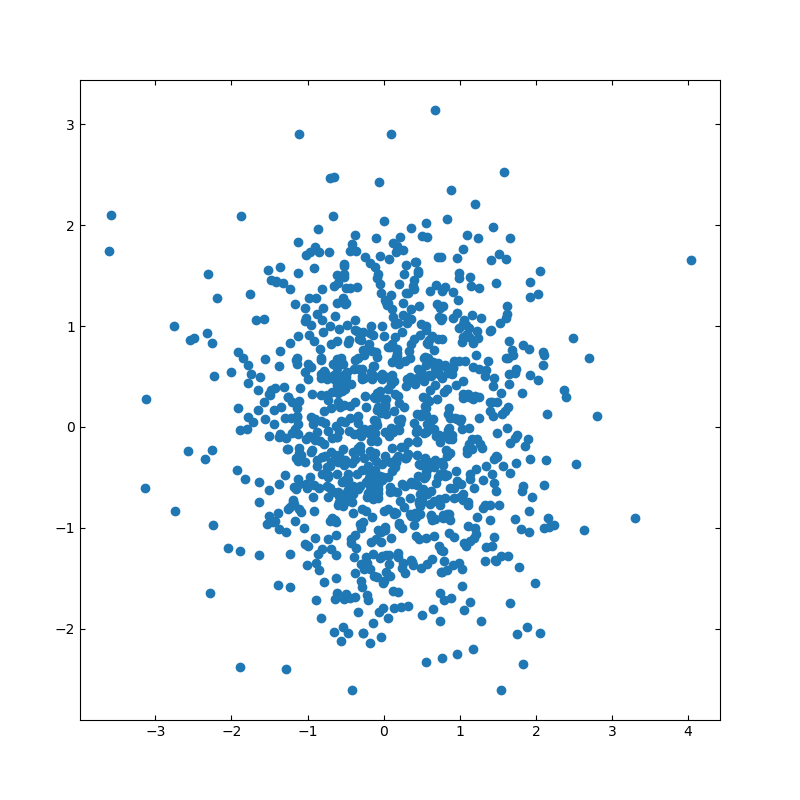
import numpy as np
import matplotlib.pyplot as plt
# 散布図のシード値
np.random.seed(19680801)
# 描画用のランダムデータを作成
x = np.random.randn(1000)
y = np.random.randn(1000)
# 軸の設定
left, width = 0.1, 0.8
bottom, height = 0.1, 0.8
spacing = 0.005
rect_scatter = [left, bottom, width, height]
# 描画サイズの設定
plt.figure(figsize=(8, 8))
ax_scatter = plt.axes(rect_scatter)
ax_scatter.tick_params(direction='in', top=True, right=True)
# 散布図の設定
ax_scatter.scatter(x, y)
plt.show()
■ヒストグラム付きの散布図
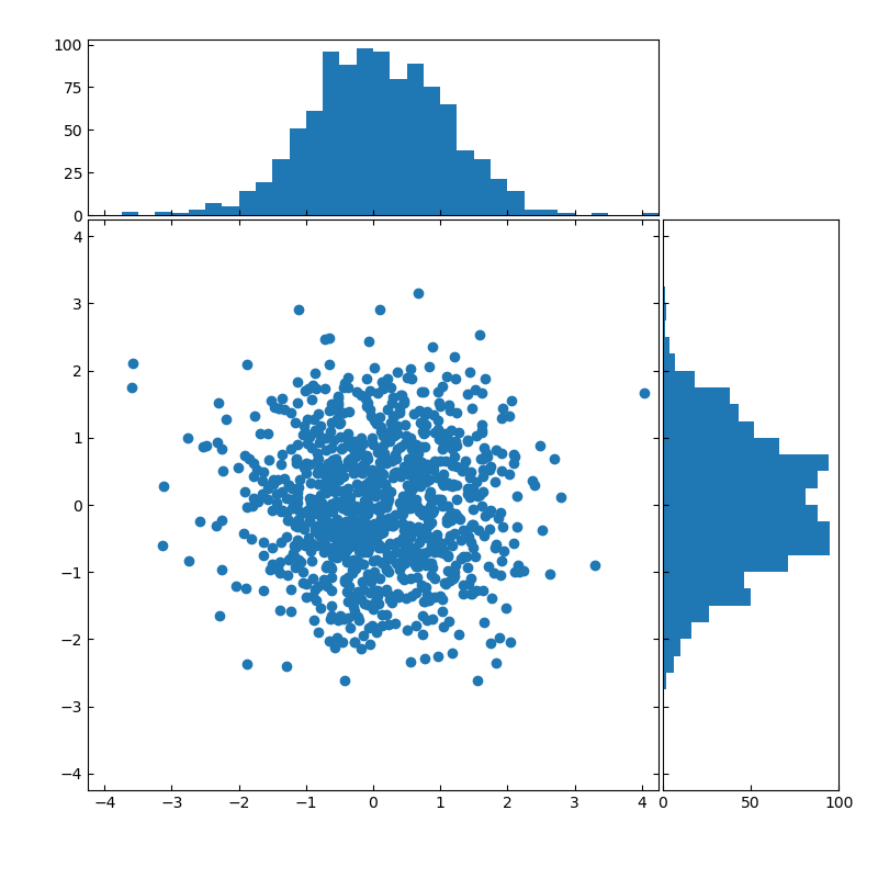
import numpy as np
import matplotlib.pyplot as plt
# Fixing random state for reproducibility
np.random.seed(19680801)
# the random data
x = np.random.randn(1000)
y = np.random.randn(1000)
# definitions for the axes
left, width = 0.1, 0.65
bottom, height = 0.1, 0.65
spacing = 0.005
rect_scatter = [left, bottom, width, height]
rect_histx = [left, bottom + height + spacing, width, 0.2]
rect_histy = [left + width + spacing, bottom, 0.2, height]
# 描画位置の指定
plt.figure(figsize=(8, 8))
ax_scatter = plt.axes(rect_scatter)
ax_scatter.tick_params(direction='in', top=True, right=True)
ax_histx = plt.axes(rect_histx)
ax_histx.tick_params(direction='in', labelbottom=False)
ax_histy = plt.axes(rect_histy)
ax_histy.tick_params(direction='in', labelleft=False)
# 描画する散布図データ
ax_scatter.scatter(x, y)
# 描画サイズを指定する
binwidth = 0.25
lim = np.ceil(np.abs([x, y]).max() / binwidth) * binwidth
ax_scatter.set_xlim((-lim, lim))
ax_scatter.set_ylim((-lim, lim))
bins = np.arange(-lim, lim + binwidth, binwidth)
ax_histx.hist(x, bins=bins)
ax_histy.hist(y, bins=bins, orientation='horizontal')
ax_histx.set_xlim(ax_scatter.get_xlim())
ax_histy.set_ylim(ax_scatter.get_ylim())
plt.show()
2020年09月25日
python:matplotlibの覚書:棒グラフ
matplotlibとは
pythonの標準ライブラリでグラフの描画に利用する
matplotlib使い方
よく使うグラフの簡単な使い方を記載しておく。
参考:公式サイトの描画例
幅広い描画方法を記載してあるため、参考になる。
サイトリンク
棒グラフ
基本
matplotlib.pyplot.bar(x, height, width=0.5, bottom=None, align='center', **kwargs)
リファレンス- x:float または array
棒グラフで描画するx軸の項目。 - height:float または array
各棒グラフの高さ。 - width:float または array
デフォルト値は0.8。各棒グラフの幅。 - bottom:float または array
デフォルト値は0。 - align:['center', 'edge']
デフォルト値は'center'。各棒グラフのボトム(下側)の値 - **kwargs
その他の設定項目。 - color:color または colorリスト
棒グラフの塗りつぶし色 - edgecolor:color または colorリスト
棒グラフの枠色 - xerr, yerr:float または array(形状は(N,)または(2,N)形状。)
誤差分散値
描画例
■基本的な描画
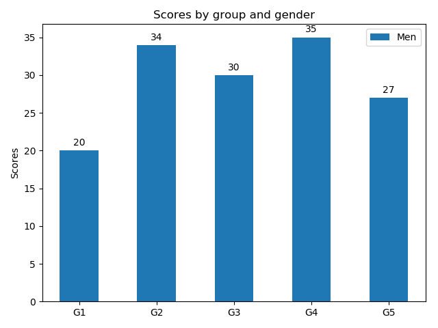
import matplotlib
import matplotlib.pyplot as plt
import numpy as np
labels = ['G1', 'G2', 'G3', 'G4', 'G5']
men_means = [20, 34, 30, 35, 27]
x = np.arange(len(labels)) # ラベル位置
width = 0.5 # 棒グラフの幅
fig, ax = plt.subplots()
rects1 = ax.bar(x, men_means, width, label='Men')
# ラベルとタイトルのセット
ax.set_ylabel('Scores')
ax.set_title('Scores by group and gender')
ax.set_xticks(x)
ax.set_xticklabels(labels)
ax.legend()
fig.tight_layout()
plt.show()
■グループ描画
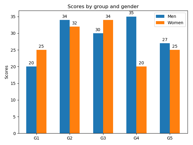
棒グラフの幅を半分にして、横位置をグラフ幅の半分だけ左右にずらして描画している。ずらす量を調整することで、3グループ以上も描画可能。
import matplotlib
import matplotlib.pyplot as plt
import numpy as np
labels = ['G1', 'G2', 'G3', 'G4', 'G5']
men_means = [20, 34, 30, 35, 27]
women_means = [25, 32, 34, 20, 25]
x = np.arange(len(labels)) # ラベル位置
width = 0.3 # 棒グラフの幅
fig, ax = plt.subplots()
rects1 = ax.bar(x - width/2, men_means, width, label='Men')
rects2 = ax.bar(x + width/2, women_means, width, label='Women')
# ラベルとタイトルのセット
ax.set_ylabel('Scores')
ax.set_title('Scores by group and gender')
ax.set_xticks(x)
ax.set_xticklabels(labels)
ax.legend()
fig.tight_layout()
plt.show()
■積み上げグラフの描画
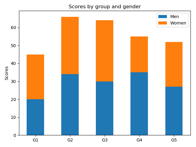
積み上げる棒グラフの底(bottom)に他方のグラフの高さを設定する。
import matplotlib
import matplotlib.pyplot as plt
import numpy as np
labels = ['G1', 'G2', 'G3', 'G4', 'G5']
men_means = [20, 34, 30, 35, 27]
women_means = [25, 32, 34, 20, 25]
x = np.arange(len(labels)) # ラベル位置
width = 0.5 # 棒グラフの幅
fig, ax = plt.subplots()
rects1 = ax.bar(, men_means, width, label='Men')
rects2 = ax.bar(x, women_means, width, label='Women',bottom=men_means)
# ラベルとタイトルのセット
ax.set_ylabel('Scores')
ax.set_title('Scores by group and gender')
ax.set_xticks(x)
ax.set_xticklabels(labels)
ax.legend()
fig.tight_layout()
plt.show()
■横向きの棒グラフの描画
import matplotlib
import matplotlib.pyplot as plt
import numpy as np
labels = ['G1', 'G2', 'G3', 'G4', 'G5']
men_means = [20, 34, 30, 35, 27]
x = np.arange(len(labels)) # ラベル位置
width = 0.5 # 棒グラフの幅
fig, ax = plt.subplots()
rects1 = ax.barh(x, men_means, width, label='Men')
# ラベルとタイトルのセット
ax.set_ylabel('Scores')
ax.set_title('Scores by group and gender')
ax.set_yticks(x)
ax.set_yticklabels(labels)
ax.legend()
fig.tight_layout()
plt.show()